Labor force participation among prime-age workers has climbed over the past few years, reversing from the substantial drop during and after the last recession. These gains might suggest that the strength of the job market is pulling people from the sidelines into the labor force. However, analysis that accounts for underlying flows between labor force states shows that, rather than drawing new people in, the hot labor market has instead reduced the number of individuals who are dropping out.
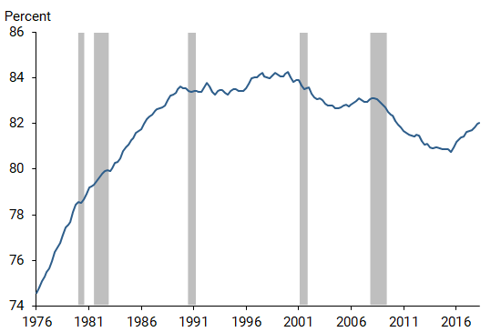
Historically, the proportion of the working-age population that participates in the labor market has not moved significantly with the ups and downs of the economy. However, this appears to have changed during the current economic expansion for workers ages 25 to 55, the prime-aged population that makes up the bulk of the workforce. Figure 1 shows that, after the sharp decline in labor force participation (LFP) during the Great Recession of 2007–09, the rebound over the past few years has been striking. The rising participation rate has led some observers and policymakers to conclude that some meaningful slack or excess capacity still exists in the labor market, even though the national unemployment rate is close to its lowest levels over the past 50 years.
Figure 1
Labor force participation among prime-age workers
Under this view, the current hot labor market could heat up further without necessarily sparking substantial pressures for wages and ultimately prices to rise, as is normally associated with a strong economy. Sustaining a hot labor market could also have long-lasting benefits by enabling marginalized workers to find jobs, build their skills, climb the job and income ladder, and hence strengthen their long-term labor force attachment (Okun 1973, Aaronson et al. 2019).
Building on Barnichon (2019), this Letter challenges the view that the hot economy is raising participation by pulling more workers into the labor force. In fact, I find that the recent increase in participation results from fewer workers leaving the labor force rather than new workers entering the labor force.
The difference between a stock and a flow
To understand why a rising participation rate does not necessarily imply that more workers are joining the labor force, it’s important to understand the difference between stocks and flows. Stocks refers to counts of individuals in different labor force states at a point in time, while flows refers to counts of individuals moving between labor force states, such as movements from the sidelines to searching for work or from seeking a job to dropping out. Using a simple analogy, the labor force participation rate—the ratio of two stocks, labor force and population—can be seen as the amount of water in a bathtub. If you turn on the tap or pull the plug, the level of water in the tub changes with the flow of water into and out of the bathtub. If the rate of water flowing into the tub increases by turning the faucet up but the draining rate remains the same, the water level will rise. Similarly, if a higher fraction of workers enters the labor force, this will increase the flow of workers entering the normal pool of labor force participants and thus increase the LFP rate. This story is the conventional explanation for the participation rate being procyclical: in tight labor markets, more workers join the labor force and participation rises.
However, this is not the only possible explanation. To see that, consider an alternative bathtub analogy. Imagine that the rate of water flowing into the tub remains the same, but the drain valve gets tightened so that less water is draining out. In that case, the water level will also rise. For the same reason, if a lower fraction of workers leaves the labor force, this will decrease the flow of workers exiting the labor force and increase the LFP rate.
These two separate reasons—a larger inflow of new workers and a smaller outflow of workers—can push the LFP rate up. As a result, the recent rise is, by itself, not enough to conclude that the tight labor market is pulling new workers into the labor force. To understand the full picture, it is necessary to study the “ins” and “outs” of worker participation flows separately.
Breaking down the ins and outs of the participation rate
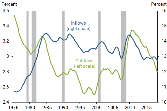
For its Current Population Survey (CPS), the Bureau of Labor Statistics surveys households in consecutive months about their labor market activities. I use the CPS to measure the flows of workers ages 25 to 55 in and out the labor force from 1976 to 2018. Figure 2 reports the results as the probability that a worker enters or exits the labor force from one month to the next. The blue line shows the inflow rate, the fraction of nonparticipants who enter the labor force each month, and the green line shows the outflow rate, the fraction of labor force participants who exit the labor force each month.
Figure 2
Inflow and outflow probabilities for prime-age workers
With these rates, I can calculate the separate contributions of inflows and outflows to the level of the overall participation rate. Figure 3 shows the contribution of the inflows (blue line) and the contribution of the outflows (green line). The sum of these two reflects the deviations of the prime-age participation from its 1978–2018 average (yellow line). For instance, the fall in the LFP rate during the Great Recession caused by the sharp increase in the outflow rate (green line) would have been even more pronounced if the rate of inflows (blue line) had not also increased.
Figure 3
The ins and outs of prime-age labor force participation
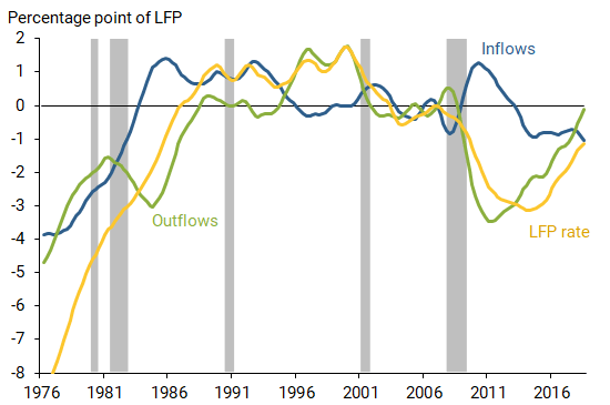
With overall participation closely following the changes in outflows during the period of the recovery and the recent increase in labor force participation, the figure clearly shows that the predominant force is the slowdown in the outflows from participation. The inflow probability has remained flat over the past three years, suggesting that the tight labor market is not bringing new workers into the labor force. Instead, the participation rate is rising because fewer workers are leaving the labor force.
The Great Recession highlights an interesting cyclical pattern that is common to each series and apparent in Figure 2: both the inflow rate and the outflow rate typically increase in recessions (indicated by the gray bars). While there are several potential explanations for the countercyclical inflow rate, researchers often point to an “added-worker effect” (Lundberg 1985) to explain why workers are more likely to enter the labor force in recessions. For example, consider a household with two adults, one working and the other out of the labor force. When a recession hits, if the main breadwinner loses that job, then the other adult might decide to try to find a job and help with household finances.
Given this situation, the countercyclical nature of the outflow rate may seem to be a paradox. The key to understanding this is to recognize that the outflow rate captures the probability of an average labor force participant leaving, so the outflow rate can vary through a composition effect. That is, the outflow rate will vary over the business cycle because the average labor force participant is not the same person in recessions as in expansions.
To see why, it may be helpful to look back at the bathtub description of the labor market. That analogy treats unemployed and employed workers as identical individuals who are equally likely to leave the labor force. However, this is a very coarse simplification: unemployed workers are in fact much more likely than employed workers to leave the labor force. Intuitively, a job seeker who fails to find a job after looking for some time may give up hope and leave the labor force. In contrast, job holders may have no obvious reason to leave the labor force. In recessions, job seekers stay unemployed longer. Because of this, the average labor force participant is more similar to an unemployed worker, and the outflow probability of the average participant is higher. Through this composition effect, the outflow rate is mechanically higher in recessions.
Understanding the outs of labor force participation
To quantify the contribution of the composition effect to changes in the outflow rate, particularly its increase during the Great Recession, I use a more elaborate accounting framework that takes into account the composition of the labor force. Figure 4 displays the contribution of the overall outflows (green line) to changes in the labor force participation rate along with two components. The influence of the labor force composition between employed and unemployed on the overall outflow rate is plotted as the blue line. Other factors that contribute to the outflows, such as changes in the propensity of employed and unemployed people to leave the labor force, are represented by the yellow line.
Figure 4
Components of outflows from labor force participation
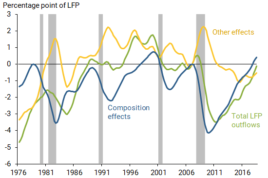
The figure shows that the composition effect is entirely responsible for the decline in overall participation during the Great Recession from 2008 to 2009. As more and more job seekers could not find a job during the crisis, they left the labor force en masse, and the participation rate plunged.
It is also apparent that the recent recovery in participation is entirely driven by the same mechanism. As the labor market tightened and unemployed workers found jobs faster, the typical labor force participant became less likely to leave the labor force. This composition effect accounts for all of the recent increase in the LFP rate. The hot economy appears to be making labor force participants less likely to leave the labor force. A similar pattern can be seen in the strong expansionary phase of the late 1990s, when the same composition effect made the average labor force participant less likely to exit, pushing up the LFP rate.
As an interesting side-benefit of this analysis, I can use my stock-flow decomposition of labor force participation to speculate about its future path. In the figure, the most recent composition effect appears to be close to its late 1990s peak, which coincided with a very tight labor market. If the late 1990s is considered a benchmark for a hot labor market, at this point there appears to be little room for further growth in labor force participation through this predominantly composition effect.
Conclusion
In this Letter, I show that, contrary to a popular and appealing hypothesis, the tight labor market is not bringing new workers into the labor force. Using micro data to construct the flows of workers into and out of the labor force, I show that the recent increase in the prime-age labor force participation rate is not driven by an inflow of new workers. Instead, the increase is a mechanical byproduct of the tight labor market: because unemployed workers are finding jobs faster, they are less likely to leave the labor force.
Regis Barnichon is a research advisor in the Economic Research Department of the Federal Reserve Bank of San Francisco.
References
Aaronson, Stephanie, Mary C. Daly, William Wascher, and David W. Wilcox. 2019. “Okun Revisited: Who Benefits Most from a Strong Economy?” Brookings Papers on Economic Activity Conference Draft, Spring.
Barnichon, Regis. 2019. “The Ins and Outs of Labor Force Participation.” CEPR Discussion Paper 13481.
Lundberg, Shelly. 1985. “The Added Worker Effect.” Journal of Labor Economics 3(1, part 1), pp. 11–37.
Okun, Arthur M. 1973. “Upward Mobility in a High-Pressure Economy.” Brookings Papers on Economic Activity 1973(1), pp. 207–261.
Opinions expressed in FRBSF Economic Letter do not necessarily reflect the views of the management of the Federal Reserve Bank of San Francisco or of the Board of Governors of the Federal Reserve System. This publication is edited by Anita Todd and Karen Barnes. Permission to reprint portions of articles or whole articles must be obtained in writing. Please send editorial comments and requests for reprint permission to research.library@sf.frb.org