An increase in U.S. aggregate labor demand reflected in rising job vacancies has not been accompanied by a similar decline in the unemployment rate. Some analysts maintain that unemployed workers lack the skills to fill available jobs, a mismatch that contributes to an elevated level of structural unemployment. However, analysis of data on employment growth and jobless rates across industries, occupations, and states suggests only a limited increase in structural unemployment, indicating that cyclical factors account for most of the rise in the unemployment rate.
Labor demand has been growing in the United States, reflected in a modest increase in private payroll employment this year and a more substantial increase in private-sector job vacancies over the past 12 months. Despite these signs of improvement, the unemployment rate has declined only slightly. Some analysts have raised the specter of a fundamental mismatch between the supply of labor in terms of workers’ skills and demand for labor in terms of employers’ skill requirements. Such a mismatch between available workers and available jobs could increase the level of structural unemployment. To the extent that structural unemployment is actually rising, the phenomenon poses a dilemma for policymakers. It cannot be ameliorated through conventional monetary and fiscal policy. And it implies an increase in the lowest unemployment rate associated with stable inflation, often identified by the acronym NAIRU, which stands for the non-accelerating inflation rate of unemployment.
This Economic Letter examines evidence for increased structural unemployment and a higher NAIRU (see Valletta and Cleary 2008 for additional background discussion). Our analysis suggests a small rise of about 1¼ percentage points in both structural unemployment and the NAIRU, increases that are likely to be transitory, not permanent.
The Beveridge curve and mismatch
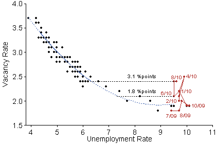
Figure 1
U.S. Beveridge curve
Monthly, December 2000 to August 2010

Source: BLS JOLTS and CPS data. Dotted blue series indicates fit of values from December 2000 to June 2009.
Policymakers and analysts who have posited a rise in structural unemployment have largely focused on the Beveridge curve, a representation of the relationship between the unemployment and job vacancy rates. The Beveridge curve is displayed in Figure 1 for the period since December 2000 when consistent data on vacancies became available from the Bureau of Labor Statistics (BLS) Job Openings and Labor Turnover Survey (JOLTS). The blue dashed line represents an estimation of the empirical relationship between the unemployment and vacancy rates that accounts for the shape of the curve. The sample used for the estimation ends in June 2009, which corresponds to the end of the recession, according to the National Bureau of Economic Research’s Business Cycle Dating Committee. The data points for subsequent months through August 2010 are highlighted in red. The position of the points for 2010 relative to the estimated curve suggests the possibility of a substantial rightward shift in the Beveridge curve, indicating a higher unemployment rate for a given level of job vacancies. The implied shift is about 1.8 percentage points for June 2010 and about 3.1 percentage points for August.
Such shifts in the Beveridge curve are commonly interpreted as representing declines in the efficiency of matching job seekers with available jobs, through reduced incentives for jobless workers to get work and increased obstacles to job matches. In the extreme, a decline in job matching efficiency may imply an increase in the NAIRU that is equivalent to the recent implied rightward shift in the Beveridge curve (see, for example, Kocherlakota 2010). In addition, the availability of extended unemployment insurance benefits, which reached a maximum of 99 weeks in most states in 2009, could explain a portion of the shift depicted in Figure 1. By easing the financial burden of long-term unemployment, extended benefits reduce the incentives of eligible workers to search for jobs and fill vacancies. Research by Valletta and Kuang (2010) suggests that the impact of extended insurance benefits on the unemployment rate in late 2009 was only about 0.4 percentage point. Updated estimates for all of 2009 and the first half of 2010 suggest a larger impact of about 0.8 percentage point.
Some observers attribute most or even the entire Beveridge curve shift to mismatches, either between the skill sets of job seekers and job requirements for existing vacancies or between the geographic locations of available workers and jobs. In the first case, for example, workers formerly employed in the construction and real estate sectors may not possess the skills required by employers hiring in the health services or technology sectors. Proponents of the second type of mismatch argue that geographical factors may be particularly acute in the wake of the housing bust. Unemployed workers face a financial obstacle that makes it hard to move to places where jobs are more abundant if the values of their homes have dropped below the amounts they owe on their mortgages. This is consistent with recent data from the U.S. Census Bureau (2010) showing historically low rates of geographic mobility.
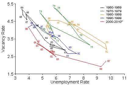
Figure 2
Long-term U.S. Beveridge curve: 1960 to 2010

Note: Annual averages of monthly data. For years prior to 2001, the vacancy rate series is calculated based on Valletta (2005). Data for 2010 are based on the first eight months.
Such skill and geographic mismatches indeed may be unusually severe in the aftermath of the recent downturn. But it may be misleading to rely on short-term Beveridge curve movements to infer the persistence of mismatches and the extent of structural unemployment over the longer term. The size of the recent Beveridge curve deviation depends heavily on the specific month chosen, varying in the first eight months of 2010 from less than 2 to nearly 4 percentage points. From January to August 2010, the average deviation was 2.5 percentage points. Historical comparisons suggest that the recent rightward shift in the Beveridge curve does not necessarily imply a similarly sized increase in the NAIRU. Figure 2 displays the long-term Beveridge curve, relying on a vacancy series constructed using historical data available prior to the introduction of JOLTS (see Valletta 2005 for the methodology). The Beveridge curve shifted rightward about 4 percentage points between the 1960s and the early 1980s and then shifted back about 2.5 percentage points between 1984 and 1989. Based on available estimates, the variation in the NAIRU over these periods was much smaller than the horizontal movement in the Beveridge curve (for example, see Table 1 in Orphanides and Williams 2002). Credible estimates of the NAIRU over these earlier periods suggest that it may have changed about half as much as the Beveridge curve. This implies that any increase in the NAIRU associated with recent movements of the curve is limited to about 1.25 percentage points, based on the average 2.5 percentage point Beveridge curve shift from January to August 2010.
Dispersion in employment growth and unemployment rates
The mismatch argument for sustained increases in the unemployment rate and the NAIRU is predicated on imbalances in labor supply and demand across sectors and skill groups. The extent of such imbalances can be assessed by examining employment growth and unemployment rates across industry sectors, states, and occupations, as shown in Figures 3 and 4. The underlying data used are the BLS payroll employment series and the authors’ calculations from the Census Bureau’s Current Population Survey microdata, which are available beginning in 1976. Industry and occupation unemployment rates are based on the most recent jobs held by unemployed individuals and exclude new labor market entrants. Only the unemployment series is shown for occupations because consistent occupational employment data are not available from BLS and cannot be reliably calculated from Census Bureau data.
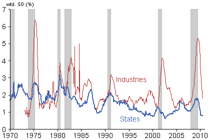
Figure 3
Dispersion in employment growth

Note: Weighted standard deviation of payroll employment growth (12-month change) across 13 major industries and 50 states plus DC. Gray bars denote NBER recessions. Data are through August 2010.
Employment mismatches would be expected to increase if job growth were uneven, with some sectors gaining while others were shrinking. The actual extent of such job reallocation can be roughly calculated by examining differences in employment growth among sectors. Figure 3 shows that dispersion in employment gains and losses spiked in the most recent recession as a result of severe, unevenly distributed job declines. For example, construction employment declined nearly 25% from the start of the recession through the end of 2009, while health and education jobs grew about 4%. Similar to past recessions, job losses have been concentrated in cyclically sensitive sectors such as construction and manufacturing. Moreover, as aggregate employment stabilized, the dispersion of employment gains and losses across sectors returned to its pre-recession level, suggesting very little imbalance in the pace of employment growth at that point.
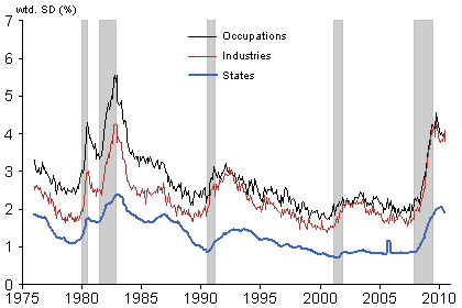
Figure 4
Dispersion in the unemployment rate

Note: Weighted standard deviation of unemployment rate across 11 occupations, 13 industries, and 50 states plus DC. Gray bars denote NBER recessions. Data are through July 2010.
Meanwhile, Figure 4 shows that dispersion in unemployment rates has remained high in recent months. Job growth has been too slow to significantly reabsorb workers idled by massive job losses in certain sectors and regions. The overhang of unemployed workers in the hardest-hit sectors suggests that some of them will need to look for work in other sectors as employment is reallocated in the economy. There is no straightforward way to assess the extent of required reallocation because it depends on unpredictable patterns of future demand. However, it is important to note that the recent peak in unemployment dispersion differs little from the peak attained during the early 1980s recession. That recession is generally acknowledged to have resulted from tight monetary policy in response to elevated inflation rates. It did not have a large mismatch or structural component, and the observed unemployment rate and the NAIRU dropped to low levels during the subsequent recovery. Given this historical precedent, current imbalances appear largely to reflect cyclical rather than structural factors.
On the other hand, the sharp reduction in construction employment and the persistence of unemployment among workers in this sector probably reflects unique circumstances related to the expansion and bursting of the housing bubble. These workers may face challenging adjustments going forward. The seasonally adjusted unemployment rate for construction workers has been hovering around 20% in recent months compared with a more typical rate from 2003 to 2006 of about 7 to 8%. This represents about 1.25 million more unemployed construction workers in the current recovery than was typical during the preceding expansion. Many of these workers are likely to be employable in other sectors as the economy improves, although a large share may not be. If half of them are unemployable, structural unemployment would increase about 0.4 percentage point. Similar special circumstances do not appear to be at play in the financial sector, despite the impact of the 2007–2008 financial meltdown. The increase in the unemployment rate for financial sector workers during the recent recession was below the average for all industries and of a relative magnitude similar to that posted in the early 1980s recession.
Conclusion
We examined evidence in favor of the view that structural unemployment and the NAIRU have increased during and after the recent recession. Based on historical patterns, the recent shift in the relationship between unemployment and vacancies reflected in the Beveridge curve is consistent with an increase in the NAIRU of about 1¼ percentage points or less. The impact of extended unemployment insurance benefits likely explains about 0.4 to 0.8 percentage point of this increase. The remainder is probably associated with the bursting of the residential real estate bubble and the need for many unemployed construction workers to find work in other sectors. The effects of both of these factors are likely to be transitory rather than permanent.
References
Kocherlakota, Naryana. 2010. “Inside the FOMC.” Speech delivered August 17, 2010, in Marquette, MI.
Orphanides, Athanasios, and John C. Williams. 2002. “Robust Monetary Policy Rules with Unknown Natural Rates.” Brookings Papers on Economic Activity 2, pp. 63–145.
U.S. Census Bureau. 2010. “Geographical Mobility/Migration.”
Valletta, Robert G. 2005. “Why Has the U.S. Beveridge Curve Shifted Back? New Evidence Using Regional Data.” FRBSF Working Paper 2005-25 (December).
Valletta, Robert G., and Aisling Cleary. 2008. “Sectoral Reallocation and Unemployment.” FRBSF Economic Letter 2008-32 (October 17).
Valletta, Robert G., and Katherine Kuang. 2010. “Extended Unemployment and UI Benefits.” FRBSF Economic Letter 2010-12 (April 19).
Opinions expressed in FRBSF Economic Letter do not necessarily reflect the views of the management of the Federal Reserve Bank of San Francisco or of the Board of Governors of the Federal Reserve System. This publication is edited by Anita Todd and Karen Barnes. Permission to reprint portions of articles or whole articles must be obtained in writing. Please send editorial comments and requests for reprint permission to research.library@sf.frb.org