Friday, May 08, 2026
4:30 p.m. PT
Stanford, California
Employment & UnemploymentFederal Open Market Committee (FOMC)InflationInflation ExpectationsLabor MarketsMonetary PolicySupply Chains
Transcript
The following transcript has been edited lightly for clarity.
Mary C. Daly:
So, the first time I was on the policy panel at Hoover, I came and I had, I think, one slide and a long text. And the person who was on the policy panel with me, like this one, was Jim Bullard and he had no texts and all slides. And I thought, “There’s a revelation.” This is a place where I can do that, so I’m going to follow suit.
I’m going to talk about something that is on our minds. When I called Valerie or emailed Valerie and I said, “What do you want us to talk about,” she said, “Something that’s not narrowly focused on policy, something that’s big in thinking about how we do macro and monetary policy strategically.” So, I’m going to talk about shocks and monetary policy, and importantly, how to assess the conventional wisdom. So, let me fix ideas by telling you what I mean by conventional wisdom.
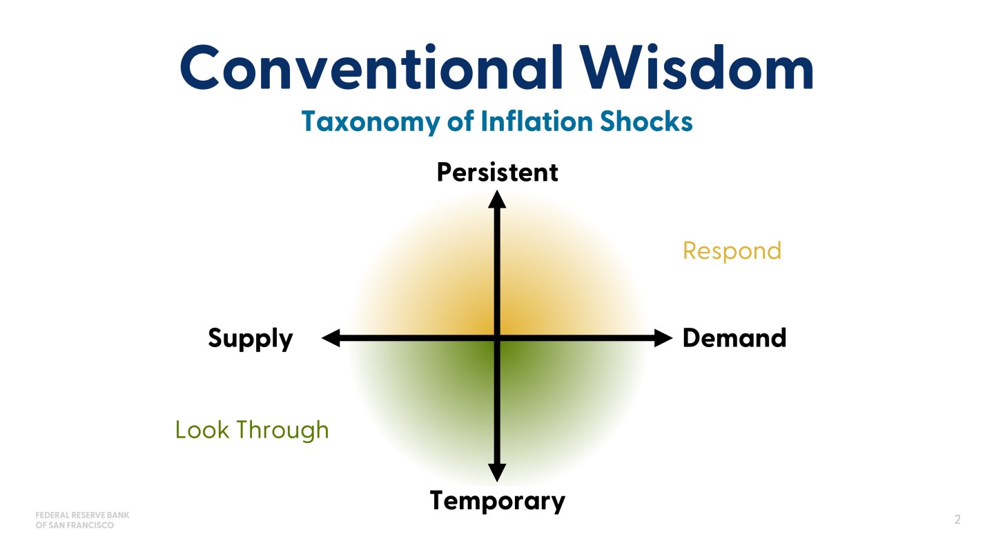
So the conventional wisdom I’m talking about is when you get a shock to the economy, then you want to understand, as a policymaker, whether it’s a supply or demand-driven shock because you want to understand what to look for, and then you want to understand if it’s persistent or if it’s temporary. And if it’s temporary, the standard conventional wisdom is you look through it and if it’s persistent, well, then, you react. You respond in some way, or at least you consider responding.
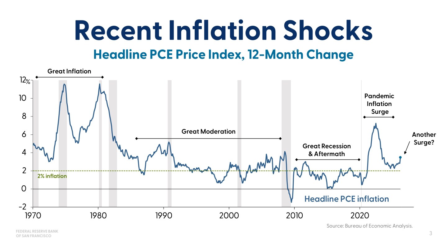
So that all works until it doesn’t. And so I’m going to do what Marvin did in many slides, I’m going to show this one slide where you can see that we had the pandemic inflation, and in the pandemic inflation we continued to say that it was transitory and thought it was transitory. It wasn’t just we’re saying it and hoping. There was a forecast that was transitory, but it wasn’t correct. And so then the subsequent runup in inflation, which doesn’t look very much, it’s another shock. It’s two shocks, actually. We had the tariff shock and then now the oil price shock, and so inflation’s picked up a bit. And it doesn’t look very different than some of the run-ups you saw in the Great Moderation or in the decade after the financial crisis. But in point of fact, it’s got a lot more attention because the concern is, “Is this going to turn into another post-pandemic surge or is it going to be the normal, ‘Hey, look through an oil shock, look through a tariff shock’?”
So, how do we know? How do we assess that? That’s the question. And early on in my career, I was told by Alan Greenspan, and then followed along by Janet Yellen, that you can’t really use models to beat models when you’re trying to forecast because you can use their history, but you don’t know how they’re going to forecast in the go forward period, and you only know ex-post if they’re wrong.
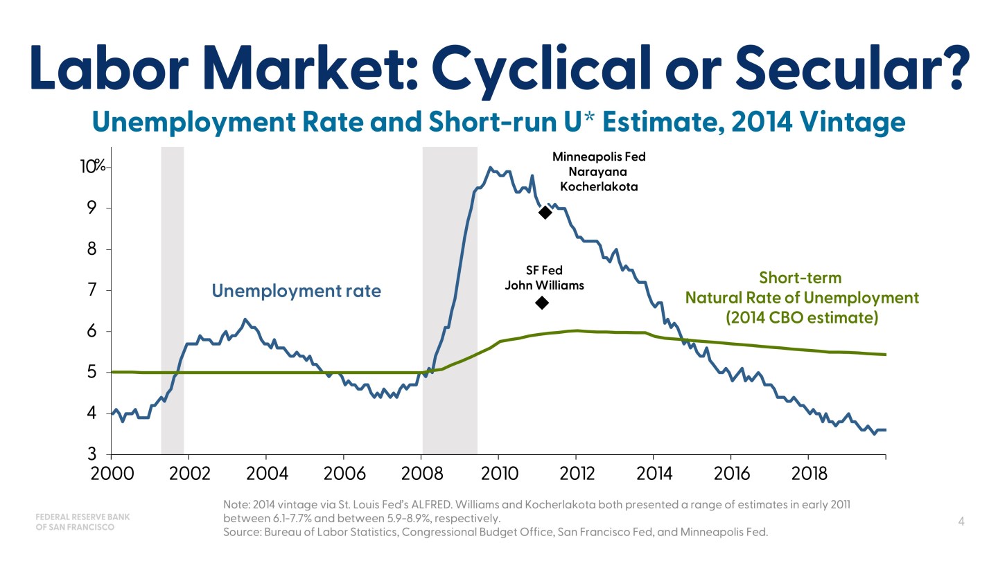
So, then what do you do? Well, we had a chance to challenge that logic when we went into the GFC. So, this is a picture from after the global financial crisis, and the debate at the time, if you like to read transcripts at the Fed, and many of the policymakers who had to grapple with that are here or usually come here, the labor market question was, “Did the enormous shock to the labor market that pushed unemployment considerably higher than we had seen in a long time, did that result in, through hysteresis or just displacement, a persistent shock that meant it was secular and the Fed couldn’t offset it, or was it simply a long-lasting cyclical shock that we could offset?”
And there were estimates at the time. Narayana Kocherlakota estimated that the natural rate of unemployment had actually risen to 8.9%. And John Williams, who was the research director at the time, and I was on his team, we somewhat argued about this a lot, but he said it was as high as 7% from his models. And the problem was that these were models that were predicting this. Narayana was saying, “You can’t make construction workers into nurses.” And John was saying, “But Laubach-Williams tells you that this is it.” And the problem is you can’t settle that debate without more information. So, we started producing more information.
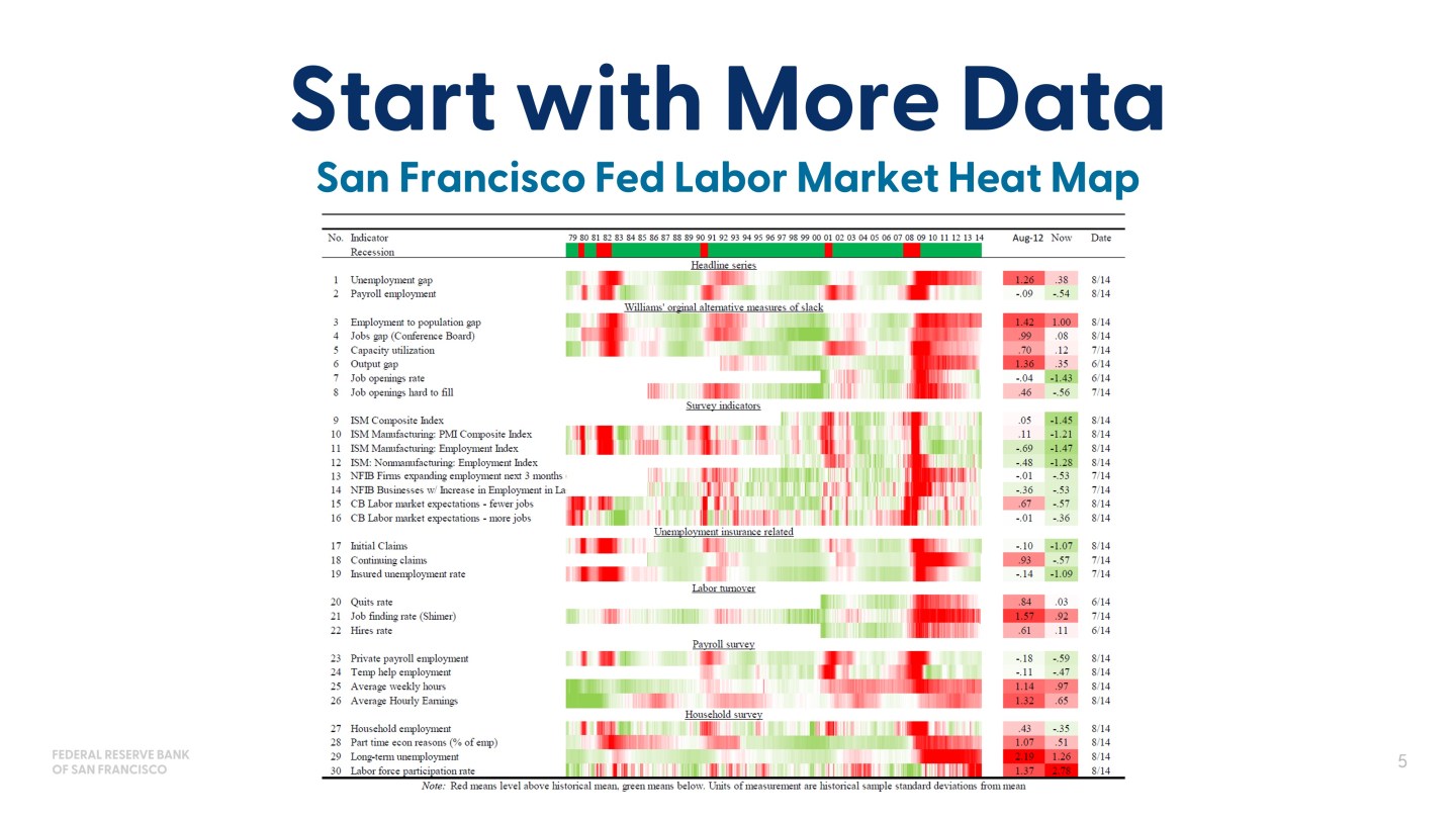
Now, you’re not going to be able to read a word of this. I don’t think reading is the point. The point is we started making what ultimately was called labor market dashboards, labor market heat maps. I’ve only got one part of the heat map. There’s actually two, three pages of this. But the point was then you take lots of data. You take as much information about the labor market as you can possibly take, you figure out whether it’s below or above its historic norms. And if you’re really thinking about this hard, which we did, this is from a briefing I gave, but you can do this. Many banks did this, many reserve banks, the board staff and many academics. You’re actually trying to understand which indicators lead, which indicators lag. When would I know we’re on a cyclical upswing? How would I know?
But even that’s dissatisfying because then you just have more data, and what would happen is the debates would come to, “Well, I like this indicator better than that one,” but we’re still just guessing about which indicators are going to tell us the truth. Not guessing, but anticipating or expecting, estimating and arguing about that.
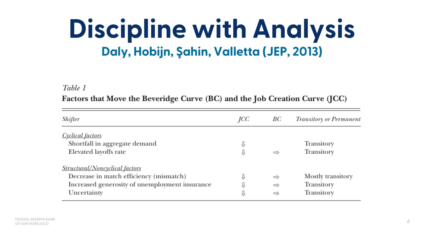
So, the next thing we did is we talked about…And many of them did this. I’m just going to focus on this, since I know it well. So I wrote a paper with Bart Hobijn, Aysegul Sahin, and Rob Valletta for the JEP, where we tackled this idea of: we’ve got a lot of data, how do we discipline into models? So, the question we wanted to know is, what would move the job creation curve and what would move the Beveridge curve? And when they intersect, what would we learn about where the natural rate of unemployment is? And we’re able to separate it with theory into cyclical factors, structural factors, and then score them as whether they would be normally in conventional wisdom, transitory, or more persistent. And then we could take that to the data. And if you’re interested, you can read the paper on that, and it’ll tell you all the different ones, but I didn’t have time to show everything.
But the point isn’t really about this paper. The point is about you take the analysis, you take the theory, you take the conventional wisdom, and then it points you to what to look for in the other sources of information you had. And ultimately, our estimate was something closer to 5.6 for the natural rate of unemployment.
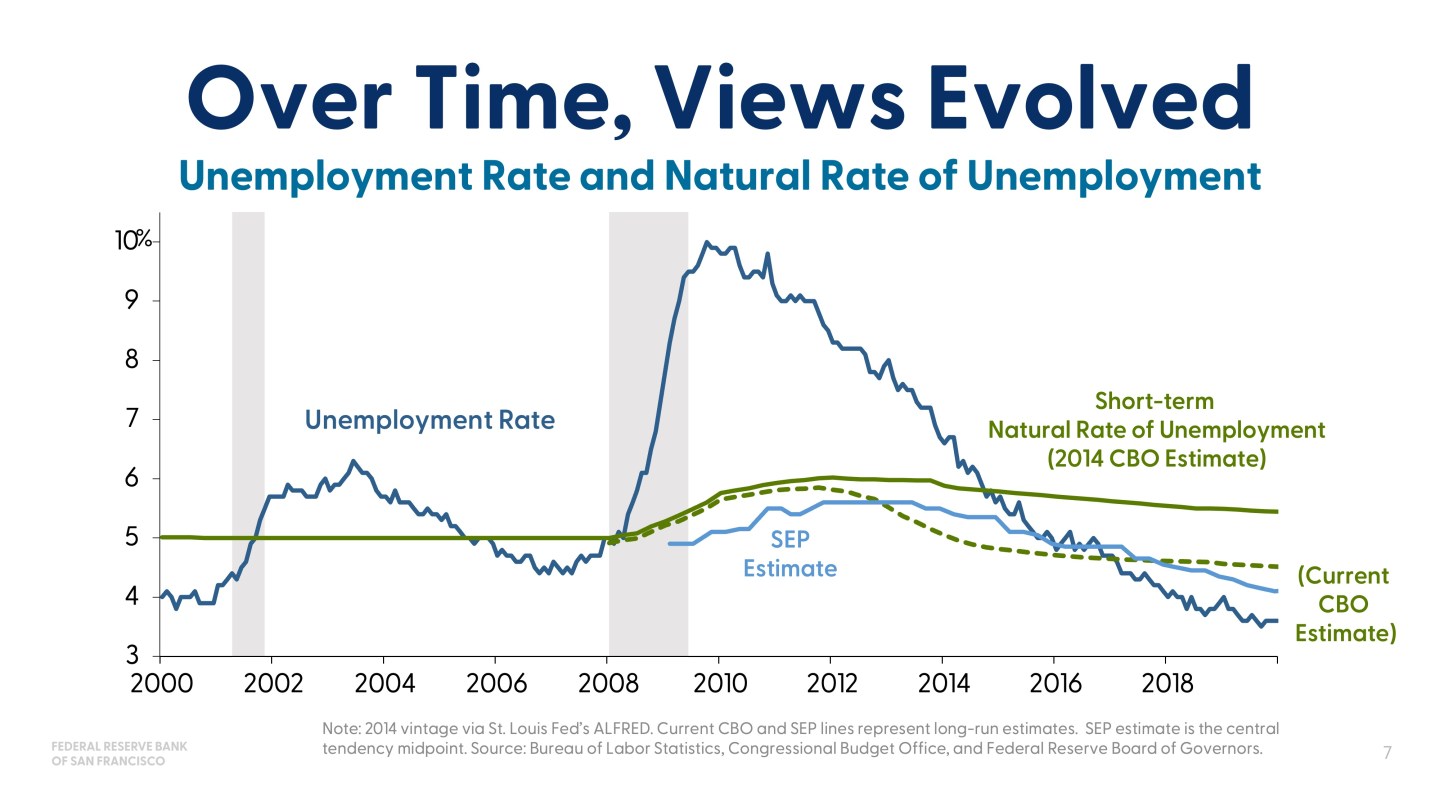
The policymakers used this and other analysis, and all the different things that academic research and policy research at the Federal Reserve was bringing to bear, to change their views. And this is a picture of how the unemployment rate evolved but also how the CBO’s natural rate of unemployment evolved, and how the summary of economic projections measure of u* evolved. And they were lower than they had originally thought, and in part we learned that from just seeing how the economy could go, but mostly we learned it from understanding that there was not a lot of evidence to suggest that it was going to be as high as it was, and there was more evidence suggesting that people can change industries. You might not make construction workers into nurses, but construction workers can definitely do other things, and it was a lot more mobility.
So, those were the pieces of information. And the point of this exercise is to say that when you don’t know the answer between models or you don’t know if it’s persistent or transitory, you start digging for more information.
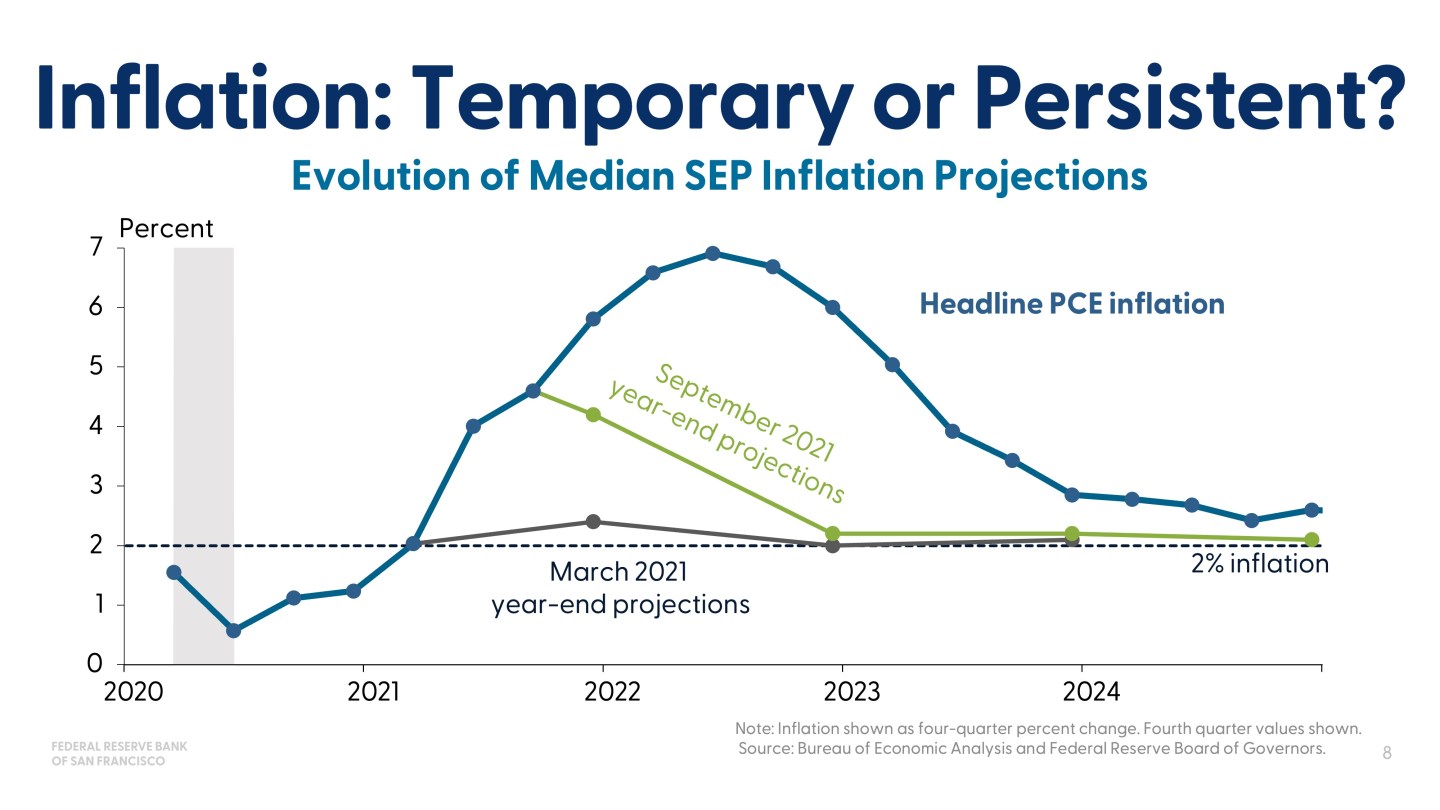
So then the question is, can we do the same thing for inflation? So let me remind you of the problem we had on inflation, which again, Marvin kind of showed, but I’m going to show you in more detail using the summary of economic projections.
So the same debate came up, is it temporary or persistent? I’m trying not to use the word transitory, so you know that temporary means that, but I’m not using it anymore. So basically what we were grappling with was inflation’s coming in. If you use conventional wisdom, it’s a supply shock. And this is before it was really clear that people were going to come out of their homes right after the Covid and then they were going to stay out of their homes and buy a lot of things, and they were going to be supported by accommodative monetary policy and supportive fiscal policy. But for a minute, put that to the side, and say a standard supply shock you look through, unless you think it’s going to be persistent, and I don’t think anyone knew at the time, most people didn’t, that this was going to be one supply chain disruption after another.
But that said, here’s the picture. Headline inflation, PCE inflation is the blue. The March 2021 year-end projections for inflation, these are the year-end projections, and this is the median of the SEP. And just out of respect for other policymakers, there were other people who had different dots, but this is the median of the SEP.
So, what you can see is that the FOMC put, in March, a marker on where inflation was when we had to make the projection, and then we also…And I was on the committee at the time, so I own this too, and we had a little bit of an increase. But then by September, we moved it up, but we still thought it’s going to come down rapidly. And so obviously, reality often is a forcing function for trying to figure out where you didn’t see something, and so we dug into what we didn’t see and how much longer would it last.
And again, many people in the Federal Reserve system did this work. I’m just going to show you things that I know very well because we were doing them in San Francisco.
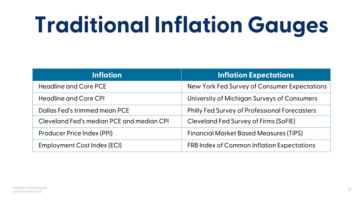
So, we recognized that these traditional inflation gauges weren’t giving us anything. And if you look at inflation, you’re getting backward answers. And so you’re still in the forecasting of how long this will last. It’s very unsatisfying to try to extrapolate from what’s happened. You also have inflation expectations, but again, those were moving around, and it was not as reassuring to say that medium run isn’t really moving, and long run is staying stable. You want to make sure you’re really sure of that. So, we started making a dashboard, really looking with the material that we had learned in the GFC. Many of us still had that experience of the unemployment rate and trying to grapple with that. And so we started building an inflation dashboard or a heat map.
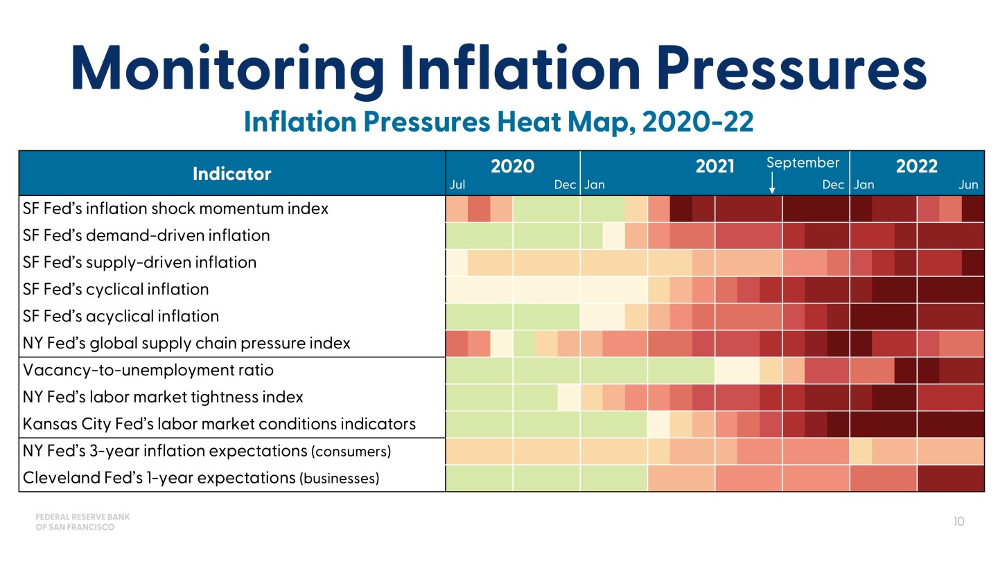
Now, I’ve put the whole thing up there, but what I want to start with is the columns. So the columns, you’ll notice, don’t look like traditional measures of inflation. They’ve got different pieces of analysis in them. These are ones that the San Francisco Fed did, like trying to decompose inflation into demand driven versus supply driven, cyclical versus acyclical responses, sector responses. We have a shock momentum index, which just asks historically, “How persistent are shocks that hit one sector versus another, and so what should we extrapolate from that?”
And then things like the vacancy to unemployment ratio. That wasn’t commonly used, if you remember, before the pandemic, to forecast or think about labor market tightness, but it was very material in this period. So, we didn’t have this dashboard when we were doing the March SEP or the September SEP, but we had it afterwards. And so I put it here just to ask the question, would it have helped us? And from this red that was very present in 2021, and certainly by September of 2021, it indicates that a lot of the elements of inflation that would be persistent were flashing red or showing red.
And it just gives you an idea that this dashboard would likely have been helpful in just understanding there was more there than what was obvious from the conventional wisdom or was obvious from taking the categories of inflation and trying to figure out if used cars were going to stay high and keep rising or go back down. So, those are the kinds of things that I think are relevant for assessing conventional wisdom and checking our work.
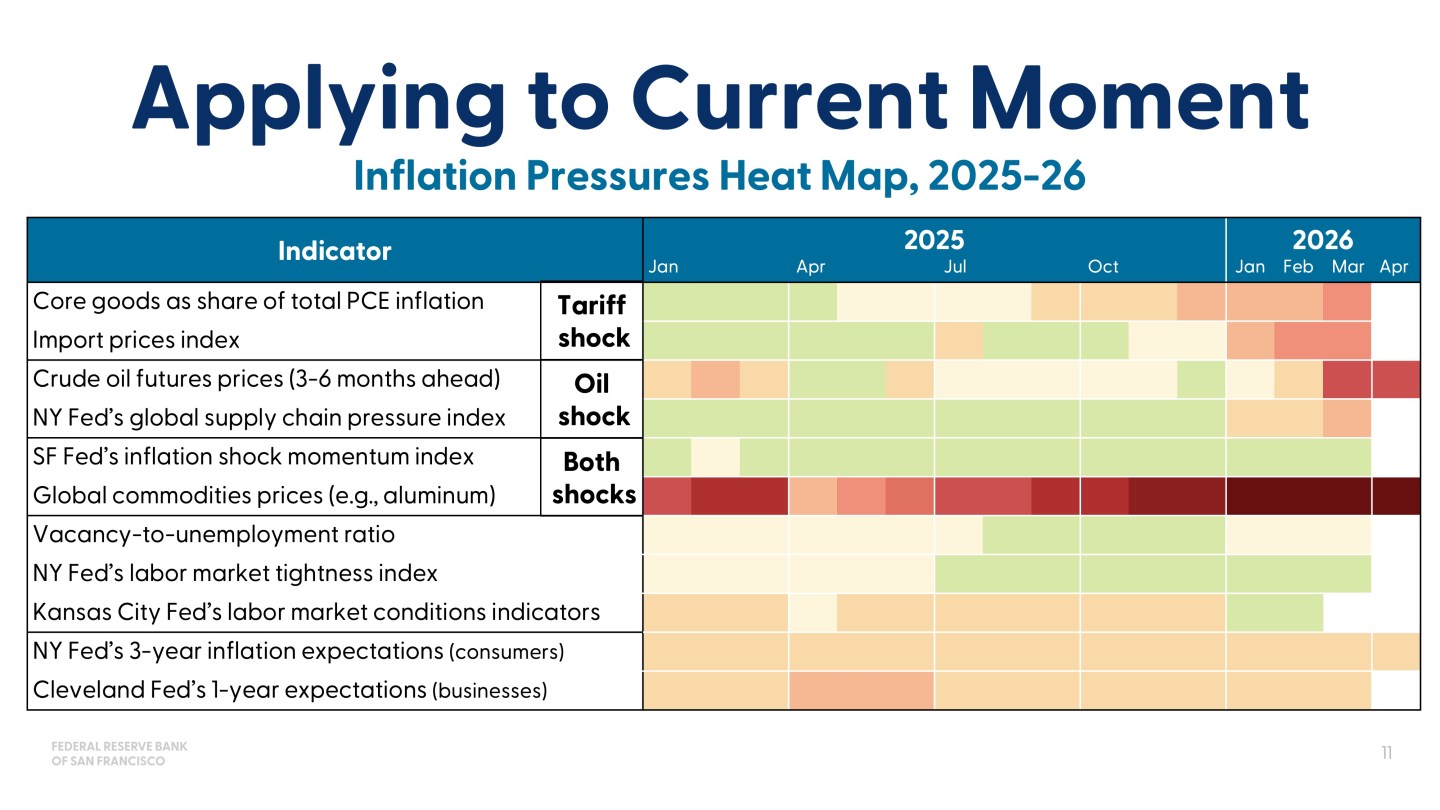
So then the final thing I’ll say in terms of the slide is, let’s apply this to the current moment. And it turned out to be helpful, at least in my own thinking, in how I thought about the inflation shock of… I’ll start with tariffs. So the conventional wisdom is tariffs are a one-off. You raise them and then you go out, then they raise inflation, but they don’t keep raising inflation. So, it goes back down as they roll through.
So we were looking at all these different measures, and many others. I’m just giving you the stylized dashboard here so that it can fit on a page. But looking at this measure, this dashboard, and many others…And only a small fraction of that dashboard was showing red or even showing pink. And it was just checking the work of, “Is it really going to be a look through?” And you do that, and we’d go out and talk to businesses too and ask them about how much they’re passing through, et cetera. But this was the part that made it easier to have more confidence, not complete confidence, but more confidence that looking through was a reasonable strategy to have while you’re being watchful that something else might change.
So, now we have the oil shock on top of that, and we only have data through April, so there’s still more data to watch. But you’re starting to see red in the areas that you’d expect. And one of the things I’m really keeping an eye on myself is not only the momentum index, but the New York Fed’s Global Supply Chain Index, which they also developed during the pandemic.
And if an oil price shock turns out to limit the supply chains and then it takes… What we’ve learned about supply chains is once they get clogged up, it takes a long time to bring them back. And so that’s the things that could lead to more persistent pressure on inflation. And this doesn’t say you’re going to have more persistent inflation. It says you’re going to have more persistent inflation pressure.
So, I offer this here, and I’ll conclude by saying that the message from all of this isn’t that you can do perfectly by looking at more data. The message of this, in my judgment, is that the Federal Reserve and any policymaker really needs to think about how do you resolve…The models are our benchmarks. They give us a starting point. Conventional wisdom is critical, I think, in terms of what has history taught us. But then history has to be disciplined, and what we understand from history, with the incoming information. And if we do that well and keep looking under every rock for things, and use analysis and models to discipline that, then we have a much better chance of seeing things before they get there.
We won’t see everything. I mean, that’s the unfortunate part of being in central banking, you don’t know everything until you know it, but you can know more than we would. And I think we’ve had a history of this. That history, for me, started in the GFC when we really dug in, but it’s extended now to the inflation shocks that we face. So, thank you very much.
Summary
Mary C. Daly, president and CEO of the Federal Reserve Bank of San Francisco, participated in a panel discussion at the 2026 Hoover Institution Monetary Policy Conference. She was joined by Federal Reserve Vice Chair for Supervision Michelle Bowman, Federal Reserve Governor Christopher Waller, and Austan Goolsbee, president and CEO of the Federal Reserve Bank of Chicago. The panel was moderated by Paola Sapienza, J‑P Conte Family senior fellow at the Hoover Institution.
Sign up for notifications on Mary C. Daly’s speeches, remarks, and fireside chats.
About the Speaker

Mary C. Daly is President and Chief Executive Officer of the Federal Reserve Bank of San Francisco. In that capacity, she serves the Twelfth Federal Reserve District in setting monetary policy. Prior to that, she was the executive vice president and director of research at the San Francisco Fed, which she joined in 1996. Read Mary C. Daly’s full bio.
Related:


