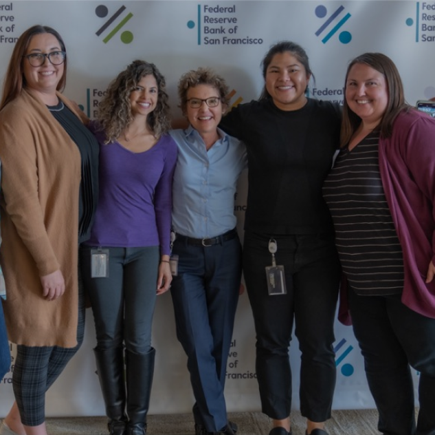
Our People
At the San Francisco Fed,
we are united in our purpose to promote an economy that works for everyone.
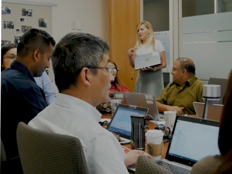
Our people bring a variety of experiences, perspectives, and expertise in a wide range of fields, reflecting the vibrant communities of the Twelfth District. Together, the SF Fed works towards fulfilling our mission of advancing the nation’s monetary, financial, and payment systems to build a stronger economy for all Americans.
Get to Know Us
Meet our leaders and experts in economic research, community development, banking supervision, ITS and other fields that impact the economy of the Twelfth District and beyond.
Connect with Our Groups
Learn more about our groups and their work in pursuit of the SF Fed’s mission.
The Federal Reserve System regulates and supervises financial institutions to ensure they operate safely.
The Regional Engagement group listens to, learns from, and shares research and information with communities across our District.
Information Technology Services
The Information + Technology Services (ITS) group maintains and protects data and provides the technology and tools to keep the SF Fed running.
The Economic Research Department conducts research on a wide range of topics in support of the Federal Reserve’s policy and public outreach functions.
We can use the lessons of the pandemic to forge a more equitable society — one with fewer gaps and greater prosperity for all.
Ready to Join Us?
Join our team of economists, cash processors, bank supervisors, cloud engineers, and more.