

Net household wealth is highly unequal across U.S. households, and the types of assets people hold tend to change according to their position along the distribution of wealth. The pattern of household portfolios shows that the top 1% of households hold most of their wealth in stocks, while home values are most important for the wealth of the bottom half of the distribution. Higher growth in equity values relative to real estate values therefore tends to widen the wealth distribution, as experienced during the coronavirus pandemic.
The average household in the top 1% of the wealth distribution is about 40 times as wealthy as the average household in the top 10–50%. The differences are even starker between the top 1% and the bottom half: the average household in the top 1% is 750 times wealthier than the average household in the bottom 50%, reflecting that a substantial share of households in the bottom half have essentially no wealth.
Wealth has historically been unevenly distributed in the United States (Saez and Zuchman 2016 and Smith, Zidar, and Zwick 2020), and its distribution has grown more unequal over the past three decades. The changes took place as productivity slowed and demographics shifted, which contributed to pushing down interest rates while asset valuations were rising. Overall wealth, which was $60.5 trillion at the beginning of 2010, more than doubled by the beginning of 2021 to $129.5 trillion. Both the top 1% and the bottom 50% increased their wealth share, though disproportionately. Wealth distribution, particularly at the top, has changed over the past three decades largely due to asset prices rather than inflation-adjusted income. Consequently, the wealth distribution has widened and decoupled from the income distribution (see Kuhn, Schularick, and Steins 2020).
In this Economic Letter, we show how the distribution evolves with changing asset valuations. The importance of this link is emphasized by the growing focus among central bankers on monetary policy’s potential impact on income and wealth inequality (see, for example, Daly 2020). We identify the differences in portfolio holdings among households as the main driver of these movements, rather than an increase in income.
The evolving wealth distribution
Figure 1 uses the Federal Reserve’s flow of funds data to track wealth distribution by percentiles over the past three decades (see Batty et al. 2020). We measure wealth as a household’s financial net worth, defined as the difference between financial assets and liabilities. Financial assets include equities, real estate, and pensions, while liabilities include mortgage and credit card debt.
Figure 1
Wealth shares for different percentiles of U.S. households
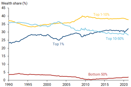
Source: Federal Reserve Board and authors’ calculations.
Financial wealth differs substantially across U.S. households. Figure 1 shows the wealth share of certain percentiles—groups divided over a distribution scale of 100%—since 1990. We break this into four groups: the top 1% (above 99th percentile), the top 1–10% (90th–99th percentiles), the top 10–50% (50th–90th percentiles), and the bottom 50% (below 50th percentile).
Since the 1990s, the distribution of wealth has become significantly more unequal. The wealth share for the top 1% has increased significantly since the early 1990s (dark blue line). Wealth share for the top 1–10% (gold line) increased during the 2000s and has remained relatively stable over the past decade as the share of wealth for the top 10–50% (light blue line) has trended downward. The bottom 50% (red line) saw their wealth share decline during the 2000s, reaching a low of 0.4% after the Great Recession of 2007–09. This group’s wealth share increased fivefold over the past decade but has not reached the same share as in the early part of our sample. These long-term trends did not play out steadily as shares for all groups experienced ups and downs along the way.
The role of asset valuations
To demonstrate how the wealth distribution moves together with asset valuations, Figure 2 shows a valuation ratio of aggregate net worth relative to disposable income by households (green line). This net worth-to-income (NW/Y) ratio measures the level of asset valuations at a given time, defined as household assets net of liabilities divided by personal disposable income. The ratio captures valuations of a broad set of assets including debt, equity, and real estate, weighted by the proportion in which they are being held by households. The NW/Y ratio functions similarly to a price-to-earnings ratio but uses household data (see Mertens, Shultz and Tubbs 2018), with market values of assets reflecting price, and disposable income reflecting earnings.
Figure 2
Valuation ratio relative to wealth shares for percentile groups
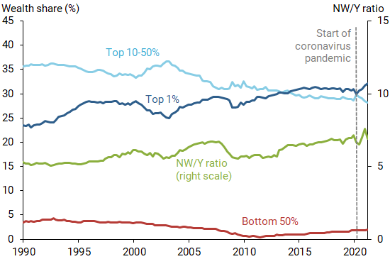
Note: NW/Y ratio is the valuation ratio of net worth to income (right scale).
Source: Federal Reserve Board and authors’ calculations.
Figure 2 shows the NW/Y ratio rose in the late 1990s during the dot-com boom and again in the mid-2000s during the housing boom before it declined during the Great Recession. Because asset prices vary more than liabilities, they are the main driver of fluctuations in the NW/Y ratio. Furthermore, changes in equity valuations contribute most of the variations in household net worth relative to disposable income over the sample period.
Figure 2 compares the wealth shares of the top 1%, top 10–50%, and bottom 50% with the NW/Y ratio. The figure shows that the top 1% moves together strongly with the NW/Y ratio. The change in wealth for the top 1% has a correlation of 0.55 with the change in the valuation ratio, reflecting that the changes mirror each other during booms and recessions. In comparison, changes in the wealth share of the bottom 50% barely respond to changes in the valuation metric. Perhaps surprisingly, changes in the share of the top 10–50% have a strong negative correlation of –0.43 with changes in the valuation ratio, meaning that the wealth share tends to fall as the valuation ratio rises.
Recent market turbulence during the coronavirus pandemic serves as a case in point. With the onset of the pandemic, asset valuations fell precipitously, along with the wealth share of the top 1%. Wealth for households in the bottom 50% fell roughly proportionately with aggregate wealth, leaving their share almost unchanged. For households in the top 10–50%, wealth levels fell by less than overall wealth such that they gained in share. The swift recovery in asset valuations, with equity valuations growing faster than real estate valuations, reversed these changes for both groups in the upper half of the distribution and widened the wealth distribution.
Portfolio composition and wealth changes
To identify potential drivers of the wealth distribution’s evolution, we investigate the composition of aggregate portfolio holdings of the various subgroups based on the latest data from the first quarter of 2021 (see Figure 3). The portfolio breaks down assets by equity and real estate holdings, pensions, and other components.
Figure 3
Types of portfolio assets across wealth distribution
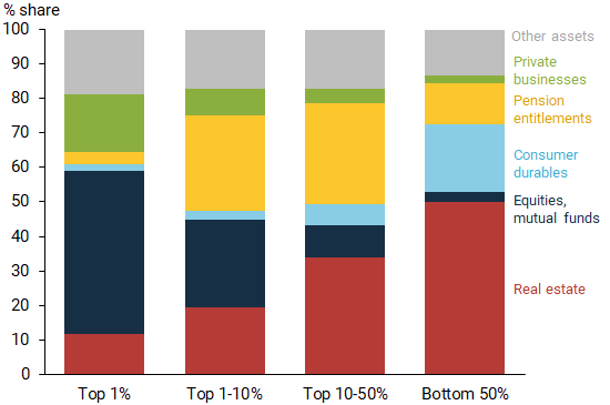
Source: Survey of Consumer Finances and Financial Accounts of the United States, 2021:Q1.
There is a clear ordering in the exposure of equity holdings (dark blue sections) among the groups. Equities make up a small share of the portfolio for the bottom 50%, while the top 1% hold nearly half of their portfolio in corporate equities and mutual funds. Generally, the higher a household is ranked in the wealth distribution, the higher is the share of equity holdings in its portfolio on average.
There is also a clear ordering among the various subgroups in terms of exposure to real estate (red sections). Real estate is the largest portfolio component for the bottom 50% and comprises more than half of their wealth. Meanwhile, the share of real estate decreases in portfolios for higher percentiles of the wealth distribution. The top 1% hold only about 12% of their assets in real estate.
The differences in asset holdings paired with changes in asset valuations explain the bulk of the comovement between the wealth share of the top 1% and changes in asset valuations, showing that equity is the main driver of changes in the NW/Y ratio.
Interestingly, the top 10–50% have a relatively lower concentration in risky assets. Specifically, their overall portfolio exposure to private business, equities, and real estate is the smallest among the groups. While the combined share for the 10–50% group comprises less than half of these assets in their portfolios, it makes up about three-quarters of the portfolios for the top 1% and slightly more than half for the bottom 50%. Instead, the top 10–50% hold other assets that do not expand strongly with overall valuations. Thus, when total wealth increases, the share of the top 10–50% actually decreases.
Similarly, the housing boom during the mid-2000s did little to bridge the wealth gap between the top 1% and the bottom 50%. Due to the higher portfolio share of real estate held by households in the bottom 50%, this housing boom might have been expected to narrow the wealth distribution. However, looking only at the portfolio assets does not capture the full picture that a breakdown by both assets and liabilities reveals. While the real estate share of all assets grew fastest for the bottom 50% during this boom, the expansion in asset valuations was funded by a substantial increase in household debt. As a result, the net worth contribution stemming from real estate did not boost the wealth share of the bottom 50%.
Figure 4 displays these developments during the mid-2000s housing boom using leverage ratios, or the ratio of liabilities to assets, for each of the wealth percentile subgroups. For the top 1%, top 1–10%, and top 10–50%, the leverage ratio remained low and constant. The leverage ratio of the bottom 50%, on the other hand, steadily rose, indicating that this group heavily relied on debt to finance their real estate assets.
Figure 4
Leverage ratios across wealth distribution groups
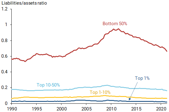
Source: Federal Reserve Board and authors’ calculations.
Real estate in particular was financed with a larger amount of debt. As a result, while their portfolio share of real estate rose for lower wealth households, so did their liabilities. Since both assets and liabilities expanded for the bottom 50% during the housing boom, their wealth, or net worth, remained relatively stable.
Conclusion
Wealth distribution changes with asset valuations due to differences in household asset portfolios: the top 1% tends to hold more wealth in equity like stocks, while the bottom 50% concentrates its wealth in housing. The findings in this Economic Letter imply that lower stock valuations relative to real estate tend to narrow the wealth distribution, as experienced early in the coronavirus pandemic. The increase in real estate valuations in the aftermath of the Great Recession helped the bottom 50% increase their wealth share. During the pandemic, equity valuations grew faster than real estate values despite a housing boom, widening the wealth gap. Taken together, while rising real estate values tend to benefit households in the bottom half of the wealth distribution, equity valuations contribute to a widening of the wealth gap.
Renuka Diwan is a former research associate in the Economic Research Department of the Federal Reserve Bank of San Francisco and a PhD student in the Economics Department at Boston University.
Evgeniya A. Duzhak is a regional policy economist in the Economic Research Department of the Federal Reserve Bank of San Francisco.
Thomas M. Mertens is a vice president in the Economic Research Department of the Federal Reserve Bank of San Francisco.
References
Batty, Michael, Jesse Bricker, Joseph Briggs, Sarah Friedman, Danielle Nemschoff, Eric Nielsen, Kamila Sommer, and Alice Henriques Volz. 2020. “The Distributional Financial Accounts of the United States.” Forthcoming in Measuring Distribution and Mobility of Income and Wealth. NBER Studies in Income and Wealth, University of Chicago Press.
Daly, Mary C. 2020. “Is the Federal Reserve Contributing to Economic Inequality?” Speech at University of California, Irvine virtual event.
Kuhn, Moritz, Moritz Schularick, and Ulrike I. Steins. 2020. “Income and Wealth Inequality in America, 1949–2016.” Journal of Political Economy 128(9), pp. 3,469–3,519.
Mertens, Thomas M., Patrick J. Shultz, and Michael Tubbs. 2018. “Valuation Ratios for Households and Businesses.” FRBSF Economic Letter 2018-01 (January 8).
Saez, Emmanuel, and Gabriel Zucman. 2016. “Wealth Inequality in the United States since 1913: Evidence from Capitalized Income Tax Data.” Quarterly Journal of Economics131(2), pp. 519–578.
Smith, Matthew, Owen Zidar, and Eric Zwick. 2020. “Top Wealth in America: New Estimates and Implications for Taxing the Rich.” Princeton University Working Paper.
Opinions expressed in FRBSF Economic Letter do not necessarily reflect the views of the management of the Federal Reserve Bank of San Francisco or of the Board of Governors of the Federal Reserve System. This publication is edited by Anita Todd and Karen Barnes. Permission to reprint portions of articles or whole articles must be obtained in writing. Please send editorial comments and requests for reprint permission to research.library@sf.frb.org