Great question. It looks like you want to know how household debt has grown over time relative to disposable personal income.1 Or, even more to the point, whether our debts are increasing faster than our incomes. This is an important and timely question in the challenging economic environment of 2009, as the financial crisis and economic recession have affected both credit and incomes. Let’s see what I have for you!
What are some common measures of household indebtedness?
Measures of household debt service
The Federal Reserve Board in Washington, D.C., calculates two frequently used summary measures of household debt burden: the household debt service ratio and the household financial obligation ratio.2 Both ratios measure what it takes for households to meet their minimum debt or financial commitments; this approach has the advantage of taking into account the effects of changes in the level of debt as well as changes in the cost of debt (interest rates):
The household debt service ratio (DSR) is an estimate of the ratio of debt payments to disposable personal income. Debt payments consist of the estimated required payments on outstanding mortgage and consumer debt.
The financial obligations ratio (FOR) adds automobile lease payments, rental payments on tenant-occupied property, homeowners’ insurance, and property tax payments to the debt service ratio. The homeowner mortgage FOR includes payments on mortgage debt, homeowners’ insurance, and property taxes, while the homeowner consumer FOR includes payments on consumer debt and automobile leases.3
For this analysis, I’ll focus on the narrower DSR because most of the increase in debt in recent years has come from increases in home mortgage debt. Let’s take a look at that measure graphically:
Chart 1

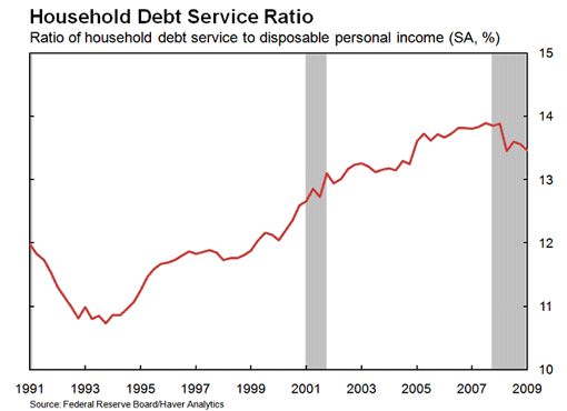
As shown in Chart 1, until the recent recession began (recessions are indicated with gray bars), American households had been putting an increasing share of their disposable income towards meeting their mortgage and consumer debt obligations. From around 1993, when this share was less than 11 percent of disposable personal income, until late 2006/early 2007 when this figure reached about 14 percent, the ratio had been on an upwards trend. However, the debt service ratio began to decline sharply during the recession that began in December 2007, falling to about 13.5 percent by the end of the first quarter of 2009.
Total household debt
Another common approach to assessing household indebtedness is to compare the level of household debt to income. Chart 2 shows how nominal disposable personal income and household debt outstanding have grown in recent decades:
Chart 2

A review of Chart 2 shows that nominal (not adjusted for inflation) mortgage and consumer household debt outstanding have grown much more rapidly than nominal disposable personal income since around the mid-1990s. By the end of 2001, household indebtedness outstanding reached about $8 trillion, matching the disposable personal income earned by households that year. After 2001, household indebtedness continued to grow faster than disposable personal income until the onset of the recession in 2007, when household debt began to fall slightly—something that is highly unusual. Household debt outstanding peaked at $13.9 trillion in mid-2008 when annual disposable personal income stood at $10.7 trillion.
Household “indebtedness”
When thinking about the two data series shown in Chart 2, economists (Dynan and Kohn, 2007, for example) calculate the ratio of household debt outstanding to disposable personal income. This ratio is shown in Chart 3:
Chart 3

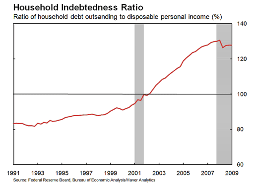
An indebtedness ratio (for more information see Dynan and Kohn 2007) above 100 percent indicates that the household debt outstanding is larger than the annual flow of disposable personal income (a ratio of less than 100 percent means the opposite). In 2002, the indebtedness ratio crossed the 100 percent mark, and it grew steadily until 2007. This ratio peaked at about 130 percent during late 2007/ early 2008 and began to fall as the impact of the financial crisis and recession hit households. The ratio fell to about 128 percent by the end of the first quarter of 2009. For another interpretation of the relationship between these two series, both for the US and internationally, please see Glick and Lansing (2009, 2010).
How did the 2007–2009 recession alter household behavior?
During the financial crisis, which began in August 2007, and the resulting recession, which began in December 2007, the trend towards increased household leverage reversed itself. There are three likely scenarios: either households are borrowing less or paying down their existing debt—or both.
First, let’s see how household net borrowing (the difference between borrowing and saving during a period), has changed over time.
Chart 4

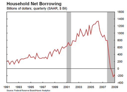
As shown in Chart 4, household net borrowing (home mortgages, consumer credit, and other loans and mortgages) grew sharply from the late 1990s until 2006. Net household borrowing peaked at around $1.34 trillion in the second quarter of 2006 before falling sharply and actually turning negative (meaning that households became net lenders) in the last two quarters of 2008 (-$73 billion and –$232 billion, respectively) and the first quarter of 2009 (-$156 billion). This shift from net borrowers to net lenders for the sector was dramatic; this was the first time since the Federal Reserve’s Flow of Funds data started being reported in 1952 that the household sector was a net lender.
Next, we see if this dramatic change is also reflected in the personal saving rate:
Chart 5

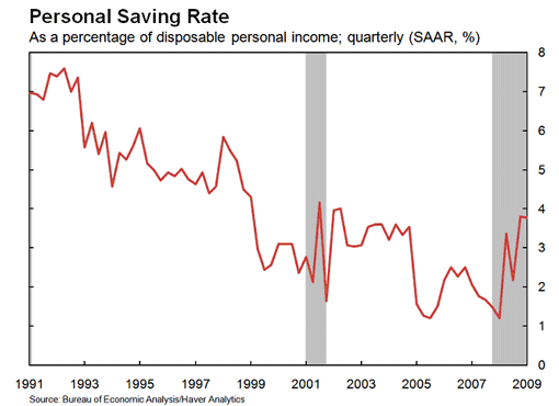
Chart 5 indicates that households are saving a much larger share of their disposable personal income. In the first quarter of 2008, the personal saving rate matched an all-time low of 1.2 percent of disposable personal income (on a quarterly basis); by the fourth quarter of that same year, the saving rate had climbed to 3.8 percent (on a quarterly basis), the highest it had been since 2002.
These changes in household behavior have important implications for consumer spending and overall economic performance. The increased saving rate—a result of consumers’ attempt to protect themselves against increased economic and financial uncertainty following the onset of the financial crisis and recession—also means a smaller share of each dollar of income will be spent on goods and services.
Conclusion
We now have a better picture of what is driving the recent episode in household de-leveraging. The ratio of household debt service to disposable personal income is falling, primarily as a result of a decline in household debt outstanding. The flow of funds data show an even more dramatic switch, as households became net lenders in the last two quarters of 2008 and the first quarter of 2009, a development that is consistent with the sharp jump in the saving rate over the past year.
At mid-year 2009, we can only speculate on future trends in the ratio of household debt to disposable personal income. We do know that future trends may depend on whether the changes in borrowing patterns and household saving behavior are temporary reactions to the financial crisis and ensuing recession, or whether they reflect longer term changes in household borrowing and saving behavior. Stay tuned
End Notes
1. Disposable personal income is the amount of income remaining after taxes—the money that individuals are able to spend on a variety of goods, services, or financial obligations. Because it measures after-tax income, economists often use this measure when studying matters relating to household financial activities.
2. See http://www.federalreserve.gov/releases/housedebt/.
3. For more on this calculation, see http://www.federalreserve.gov/releases/housedebt/about.htm