Digging below the headline data can provide a fresh perspective on how changes in the economy are affecting different groups of people. Our new SF Fed Data Explorer gives people a tool to more easily take that deeper dive and learn more about the U.S. labor market.
The SF Fed Data Explorer is an interactive data application that helps users explore key outcomes for specific demographic groups and time periods. The tool draws on publicly available data updated each month from the Current Population Survey (CPS), a joint program of the Census Bureau and Bureau of Labor Statistics.
Why explore the data?
The idea for the SF Fed Data Explorer came from my research with coauthors examining how workers were recovering following the severe disruptions to the economy brought on by the onset of the COVID-19 pandemic. The labor market appeared to be rebounding after a couple of months, as people went back to work. However, the story wasn’t the same for all groups of workers.
Our research broke down the employment numbers and found that mothers—particularly among Hispanic and Black populations—were being left behind in the jobs recovery. A pattern of slower recoveries in employment for particular demographic groups had appeared before in the aftermath of previous recessions. Indeed, the experience coming out from the Great Recession taught us that long and stable economic expansions are key to pulling certain demographic groups back into the labor market.
As we headed into 2022, we wanted a tool to keep close track of progress in the labor market for a diverse set of groups as part of the research input we provide to President Mary Daly in preparation for her deliberations with her colleagues at the Federal Open Market Committee.
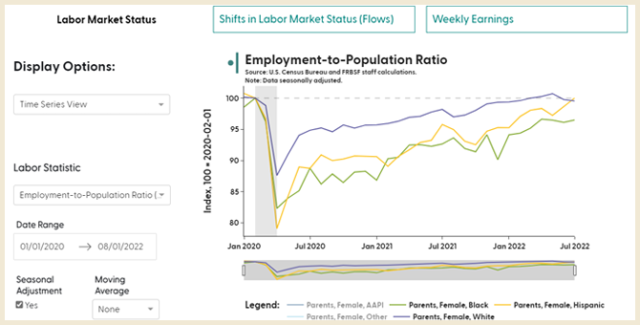
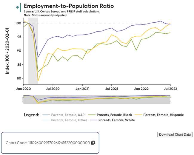
The SF Fed Data Explorer grew out of this need to track the evidence on labor market experiences for broad and diverse groups in the U.S. population. For example, a regular look at the data below has shown how the strong economy over the past year has helped bring mothers back into the workforce. The data on mothers is divided into different demographic groups. The yellow line shows that employment gains for Hispanic women have been strong, closing the gap caused by the pandemic. The green line shows us that Black mothers have still not closed the remaining gap caused by the COVID-19 disruptions.
How does the SF Fed Data Explorer help?
Considering the Data Explorer is based on publicly available data, what’s the benefit of using this tool?
One thing we learned from our research is that it takes a lot of work to organize the large CPS data set on the U.S. labor force into a format that is directly ready for analysis. Each time someone wants to use the data, they face the same barrier to access that we faced. By organizing the disaggregated data into an easily accessible structure, we can help others save time.
Our next goal was to provide a way for others to use the data to make comparisons and find their own stories. Ultimately, the easiest way to do that is by visualizing the data through charts. As an added bonus, we built in an easy way for people to share the charts they create with others, using a unique auto-generated chart code.
Who can use the SF Fed Data Explorer?
Our team of research associates, technical specialists, and economists have built this application to be accessible to a broad set of users.
The website includes video tutorials demonstrating how to create individual charts, infographics, and other output for the general public. The charting tool includes explanations of why specific measures are useful for understanding the economy and definitions of terms that can be useful for students, as well as a teacher’s guide to the tool.
For researchers, the tool provides a ready resource to access the disaggregated data and downloadable data sets based on charting preferences.
The tool can also provide relevant data visualizations about labor market dynamics for policymakers, community and business leaders, and members of the news media.
We invite you to chart your own story using the SF Fed Data Explorer and share it with others using the chart code.
Nicolas Petrosky-Nadeau is vice president in the Economic Research Department of the Federal Reserve Bank of San Francisco.
You may also be interested in:
The views expressed here do not necessarily reflect the views of the management of the Federal Reserve Bank of San Francisco or of the Board of Governors of the Federal Reserve System.