
Social distancing behavior and weather are two factors that infectious disease experts have identified as key determinants of the spread of COVID-19. Because the pandemic has had a dramatic effect on the economy, understanding and predicting how these factors affect the disease’s spread is also highly important for the economic outlook.
This is the goal of a new SF Fed data page, COVID-19 Forecasts by County. The page provides U.S. county-level forecasts of COVID-19 infection growth rates, which will be updated weekly, based on the econometric model developed in “Weather, Mobility, and COVID-19: A Panel Local Projections Estimator for Understanding and Forecasting Infectious Disease Spread” (Wilson 2020).
What goes into the forecasts?
We use county panel data from early 2020 through the latest available data to estimate a panel fixed-effects regression equation.
The equation is based on an epidemiological model of infectious disease spread, known as the Susceptible-Infectious-Removed (SIR) model. It relates a county’s future growth—measured as the change in the log number of infected residents over a specific length of time—to current and past values for observable drivers of disease transmission.
These drivers of COVID-19 transmission include social distancing behavior (mobility), weather (temperature and precipitation), and confirmed COVID-19 cases per capita to date. The regression also includes county fixed effects and county-specific linear time trends. This allows counties to have different levels and trends in their infection growth rates that are independent of the differences in those observed drivers of transmission.
The data used to estimate the regression and generate our forecasts come from daily county-level, near real-time information on weather, mobility, and COVID-19 cases. The data page lists sources and provides a downloadable data file.
The forecasts also incorporate state-level data from Centers for Disease Control and Prevention on vaccinations. To do so, the data need to be adjusted to use for individual counties. Specifically, counties are assumed to have the same share of their population fully vaccinated as their state’s average, and vaccinations are assumed to be 95% effective. In accordance with the standard SIR model, this effective vaccination share of the population directly reduces forecasted growth in infections. In other words, vaccinations move people from the susceptible category (S) to the removed category (R).
Three insights from the regression estimates
Estimating these regression equations over various time horizons using data from the start of the pandemic through late 2020 yields three interesting results. (See Wilson 2020 for details.)
- Changes in mobility behavior have large effects on COVID-19 infections over the subsequent few weeks. For example, the more time residents spend away from home is associated with substantially higher rates of infection spread.
- Changes in temperature also have significant effects, with colder temperatures generally leading to higher growth in COVID-19 infections.
- Holding mobility and weather fixed, COVID-19 growth within a county is negatively autocorrelated. That is, recent growth in infections in an area is predictive of subsequent growth, such that higher growth now is associated with lower or even negative growth in the future.
The forecasts based on these equations can be updated regularly, whenever new data on mobility, weather, cases, and vaccinations become available. Assuming there are no disruptions in the underlying data feeds, we plan to update the forecasts for growth in active COVID-19 infections weekly.
Overview of infection growth forecasts by county
The data page forecasts infection growth for over 2,700 counties for time horizons ranging from 10 days ahead to 70 days ahead. For example, Map 1 shows the 30-day-ahead forecast horizon, based on the latest available data, which goes through January 23, 2021, as of the time of this writing.
Map 1: Projected Growth of COVID-19 Infections by County, 30 Days Ahead
(Data available through January 23, 2021)
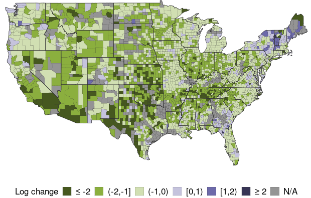
Mean Predicted Value = -0.8950
Mean Predicted Value (Weighted) = -0.9566
Note: Map 1 shows each county’s projected growth in infections, color-coded into one of five groups, ranked from the most negative to most positive; gray shading indicates insufficient data. Growth is measured by the change in log active infections from the date listed to 30 days later.
The model predicts strong declines in infections in the Midwest and most of the Southwest, and increases in some parts of the Northeast and the Pacific Northwest. Nationally, it predicts infections to fall by roughly -60% over the next 30 days, based on a population-weighted average of the forecasts for approximately 2,700 counties.
To put these forecasts in perspective, Map 2 shows the actual change in log active infections over the past 30 days, based on approximating active infections using data on cases; see Wilson (2020) for details.
Map 2: Actual Growth of COVID-19 Infections by County, 30 Days Prior
(Data available through January 23, 2021)
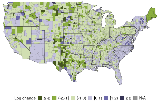
Mean Actual Value = -0.2433
Mean Actual Value (Weighted) = -0.0885
Note: Map 2 shows each county’s actual growth in infections, color-coded into one of five groups, ranked from the most negative to most positive; gray shading indicates insufficient data. Growth is measured by the change in log estimated active infections from 30 days prior to the latest date of data.
Map 2 shows that actual growth in infections—inferred from data on confirmed cases over the prior 30 days—was positive in about half of counties and especially high along the coasts. National growth in infections, measured by the population-weighted average of growth over counties, fell by nearly -9%. Thus, the prediction of infections being cut in half over the next 30 days, as in the Map 1 forecast, would represent a dramatic improvement.
Checking forecast accuracy
One way to assess the accuracy of the forecasting model is by comparing the actual data for a specific period with a forecast for the same period. Map 3 shows the model’s out-of-sample forecasts of the change in log active infections over the same 30-day period as in Map 2, using data only up to the beginning of that period. The strong similarity between Maps 2 and 3 indicates relatively high accuracy of the forecasts.
Map 3: Prior Month Projections for Infection Growth by County
(Projection for 30 Days Ahead as of December 24, 2020)
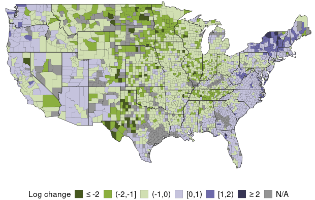
Mean Predicted Value = -0.2934
Mean Predicted Value (Weighted) = -0.0837
Note: Map 3 shows the earlier 30-day-ahead projections for the period in Map 2, to illustrate forecast accuracy. Each county’s projected growth is color-coded into one of five groups, ranked from most negative to most positive; gray shading indicates insufficient data. Data are based on the forecasted value of the change in log active infections from the date listed to 30 days later.
It appears the forecasting model generally correctly predicted that infection growth would be low or negative in the Midwest, while being strongly positive in much of the Northeast. Yet the model seems to have somewhat overpredicted infection growth in the Northwest.
More formal evidence on forecast accuracy is provided on the data page and indicates that the forecasting model is fairly good at predicting the cross-county distribution of COVID-19 growth—that is, the likely hot spots and areas likely to see the most improvement—and at predicting aggregate growth. In general, the model tends to produce relatively large errors for any single county, but these errors tend to cancel out when aggregating to the national level.
Daniel J. Wilson is a vice president in the Economic Research Department of the Federal Reserve Bank of San Francisco.
Image credit: marimo via iStock.
You may also be interested in:
The views expressed here do not necessarily reflect the views of the management of the Federal Reserve Bank of San Francisco or of the Board of Governors of the Federal Reserve System.