Yield curves track the relationship between interest rates and the maturity of U.S. Treasury securities at a given time. The slope, shape, and level of yield curves may vary over time with changes in interest rates. Analysts often look at yield curves because they may provide clues to financial market conditions and future interest rates. We’ll compare several yield curves and see what information they might provide economists.
How do you build a yield curve?
Let’s start by describing the typical yield curve—each curve provides a snapshot of the term structure of interest rates. A yield curve plots interest rates on U.S. Treasury securities as of a particular date by their maturity—by how many months or years in the future they will mature. Note that by using only Treasury securities all the securities have similar characteristics—such as risk and tax status. A typical yield curve for Treasury securities might include the interest rates for a series of maturities, ranging from the short-term (three-month Treasury bills) to the long-term (ten- or twenty-year Treasury bonds).
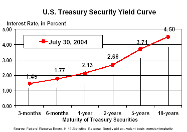
Chart 1 provides a sample yield curve for July 30, 2004. Remember, you can plot yield curves daily because interest rates may change daily. In the charts below, we create average yield curves for longer periods, months, or years, and use those to compare the term structure of interest rates for different time periods and to observe trends and shifts in interest rates.
Chart 1
Slope, shape, steepness, shifts
The slope of the yield curve provides an important clue to the direction of future short-term interest rates; an upward sloping curve generally indicates that the financial markets expect higher future interest rates; a downward sloping curve indicates expectations of lower rates in the future. The shape of a yield curve also may provide clues to future interest rate movements—a humped curve indicating that short-term rates (over the next year) are expected to rise, but that over the long-run (several years) rates are expected to fall. The overall level of the yield curve also may shift up or down—at least in part because of changes in inflationary expectations over time.
More about the slope of the yield curve
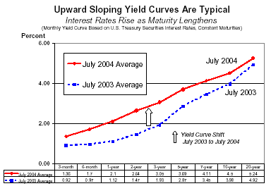
Over the past 25 years, by far the most common shape of the yield curve has been upward sloping, meaning that yields rise as the maturity of the security lengthens—or to put it another way, longer term securities pay higher returns. An upward sloping yield curve suggests that financial markets expect short-term interest rates to rise in the future. Clearly, in 2004, this makes sense because short-term interest rates are already at or near their lowest level in more than four decades. Upward sloping yield curves (calculated from monthly average interest rates) for two months, July 2003 and July 2004, are compared in Chart 2. Note also that the steeper the slope of a yield curve, the faster interest rates rise as maturity lengthens.
In addition to the slope of the yield curve, we also are interested in changes or shifts in yield curves over time. The upward shift in the yield curve from July 2003 to July 2004 most likely reflects increased strength in the overall economy over the period rather than an increase in inflation expectations. Real GDP growth more than doubled on a year-over-year basis from the second quarter of 2003 to the second quarter of 2004, while economists projected little change in inflationary expectations over the two periods.
Chart 2
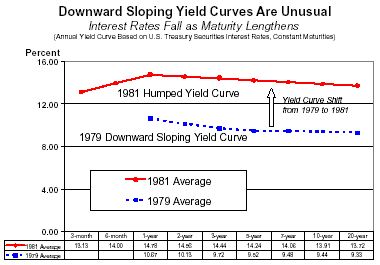
Occasionally, typically during periods of tight monetary policy, short-term interest rates may rise above long-term rates and the yield curve becomes partially or entirely inverted or downward sloping. Downward sloping yield curves (calculated from annual average interest rate data) for the years of 1979 and 1981 are shown in Chart 3; a downward-sloping yield curve generally implies that for both years the financial markets expected lower short-term interest rates in the future. During the late 1970s and early 1980s, the U.S. economy experienced a period of rapid inflation and high interest rates. The upward shift in the yield curve from 1979 to 1981 likely reflected the surge in inflation and higher inflation expectations over this period when inflation rose at double digit rates.
Chart 3
Finally, yield curves also may be flat across the maturity spectrum, as they were most recently for the years 1989 and 2000, shown in Chart 4. In these two years there was little premium for holding longer term securities. Let’s examine the shift in the yield curve between these two periods. In 1989, interest rates for all maturities were yielding around 8.5 percent, whether they were for 3-month or 20-year Treasuries. Between 1989 and 2000, the yield curve shifted down around 2.4 percentage points for each maturity, so that by 2000, the yield curve was again flat—but this time at a lower level, around 6 percent.
Chart 4
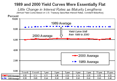
The difference in the level of the yield curve between these two periods likely reflects a significant change in inflation expectations from 1989 to 2000. In 1989, the Federal Reserve Bank of Philadelphia’s Survey of Professional Forecasters (http://www.phil.frb.org/econ/spf/) average one-year ahead inflation forecast for the Consumer Price Index was 4.6 percent; by 2000 the inflation forecast had dropped 2 percentage points to 2.6 percent. Between these two periods with flat yield curves, the yield curve shifted down about 2.4 percentage points while inflation expectations fell about 2 percentage points.
Historical trends
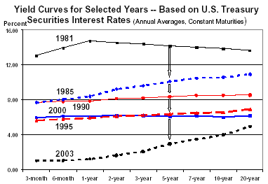
Finally, let’s give you some historical perspective by plotting several annual yield curves taken from the period from 1981 to 2003. Remember that over this period you could have calculated a yield curve for every day! First, the curves shown in Chart 5 illustrate how the yield curve has been moving down over time as interest rates have generally declined over time. One key reason is the decline in the inflation rate; measured by the CPI, inflation fell from over 13.5 percent in 1981 to 2.3 percent in 2003. Notice also that among the flat and upward sloping curves shown, the steepness shows a lot of variability from year-to-year—be aware that daily curves will show much more variation than yield curves calculated from annual average data. The 2003 yield curve is the steepest shown, mainly reflecting the fact that short-term interest rates have been lowered to historically low levels by the Federal Reserve’s efforts to stimulate the economy.
< p align="center">Chart 5
Additional Information: Building your own yield curve
Interest rate data for U.S. Treasury securities are available from the Federal Reserve Board’s H.15 Release, Selected Interest Rates. That’s a great place to go if you would like data to calculate your own yield curves. Instruments of the Money Market, published by the Federal Reserve Bank of Richmond, provides additional background information on yield curves in its chapter on Treasury Bills.
References
[urls accessed in September of 2004]
Blanchard, Oliver. (1997) Macroeconomics, Prentice-Hall, Upper Saddle River, New Jersey. See Chapter 9.
Consumer Price Index, Bureau of Labor Statistics website.
http://www.bls.gov/cpi/home.htm
Instruments of the Money Market. (1998) Federal Reserve Bank of Richmond. See Chapter 7.
http://www.richmondfed.org/publications/research/special_reports/instruments_of_the_money_market/pdf/chapter_07.pdf
King, Robert G., and André Kurmann, (2002) Expectations and the Term Structure of Interest Rates: Evidence and Implications, Economic Quarterly, Federal Reserve Bank of Richmond. Fall 2002, Vol. 88, No. 4.
http://www.richmondfed.org/publications/research/economic_quarterly/2002/fall/kingkurmann.cfm
Rose, Peter S. (1994) Money and Capital Markets, Irwin, Burr Ridge, Illinois, See Chapter 9 for additional information on the structure of interest rates.
Selected Interest Rates, Federal Reserve Board of Governors website.
http://www.federalreserve.gov/releases/
Survey of Professional Forecasters, Federal Reserve Bank of Philadelphia website.
http://www.phil.frb.org/econ/spf/
Stiglitz, Joseph E., and Carl E. Walsh. (2002) Principles of Macroeconomics. W.W. Norton & Company, New York. See Chapter 4.