

Countries’ commitments to reduce carbon dioxide (CO2) emissions can have important implications for their economies. Data since the 1800s reveal that the amount of CO2 emissions generated for a given level of output follows a bell-shaped curve. Pairing this with projections of future economic growth can help in predicting future overall emissions. Comparing actual data with past projections for levels of emission intensity reveals that reductions have been slower than predicted over the past 40 years. This divergence highlights the challenges many countries may face in reaching their emissions targets.
Most countries have committed to reducing carbon dioxide (CO2) emissions over the next few decades (United Nations 2021). These commitments can have important economic implications because they may involve reconfiguring the energy sector, adopting new production technologies, and a general shift in the industrial makeup of economies, to name a few (Fried, Novan, and Peterman 2021 and Gillingham and Stock 2018).
In this Economic Letter, we use historical CO2 emissions data to evaluate the evolution in the emission intensity of production. This refers to the amount of CO2 emissions per dollar of economic output produced, which can be used as a measure of emissions efficiency. The lower the emission intensity, the more likely countries are to meet their emissions targets given current trends of output growth. In assessing trends in emission intensity, we focus on the six largest carbon-emitting countries, which collectively represent about 75% of world emissions. Three of these countries—the United States, Japan, and Germany—represent advanced economies that developed early in the 20th century with highly inefficient technologies in terms of CO2 emissions. Over time, they have brought down their emissions per dollar significantly. The other three countries—China, India, and Russia—represent emerging economies that went through their industrial transition much later in the 20th century. Because production technologies available at that time had evolved to create less pollution, these three countries now face a quicker path toward cleaner production.
Based on this historical evidence, we find that the emission intensities of these two groups over time can be approximated well by bell-shaped curves. We examine different economic growth scenarios and their implications for CO2 emissions relative to reduction commitments. Our analysis suggests that future paths of economic growth and efforts to reduce emission intensity are both important factors in assessing whether these countries will meet their stated targets.
Emissions: Lessons from history
Following the 2021 United Nations Climate Change Conference in Glasgow, commonly known as Glasgow COP26, world leaders reaffirmed their commitments to reducing CO2 emissions and limiting the increase in global average temperature to 1.5° Celsius (United Nations 2021). Achieving this target is likely to require countries to significantly reshape their economies, which can involve considerable transition costs (Gillingham and Stock 2018).
How can countries reduce fossil fuel emissions? At a basic level, there are only two ways: reduce overall economic output, and thus income and consumption for their citizens, or become more efficient by using cleaner technologies to produce the same goods and services with fewer emissions.
Written simply, the level of emissions equals an economy’s emission intensity multiplied by its economic output growth. Breaking down the problem into these two components is similar to approaches that some researchers use to forecast CO2 emissions (for example, Kaya and Yokobori 1997). Our approach provides a way to easily assess a country’s progress on its road toward lower emissions.
We begin by examining world emission intensity. Figure 1 displays global CO2 emissions divided by global GDP measured in U.S. dollars, which is a common way to compare output growth across countries, over the past 200 years. The dashed line shows the fit from a bell-shaped curve. We create the curve using three parameters that correspond to the peak intensity, when the peak occurs, and how long it takes for intensity to decline from the peak. The shaded regions are 68% confidence bands, which indicate the uncertainty related to the combination of our parameter estimates and how well the curve fits the data. The figure shows that a bell-shaped curve fits the historical path of emission intensity very well, capturing the rise of world intensity up to the 1920s and the gradual improvement since then.
Figure 1
Global CO2 emission intensity
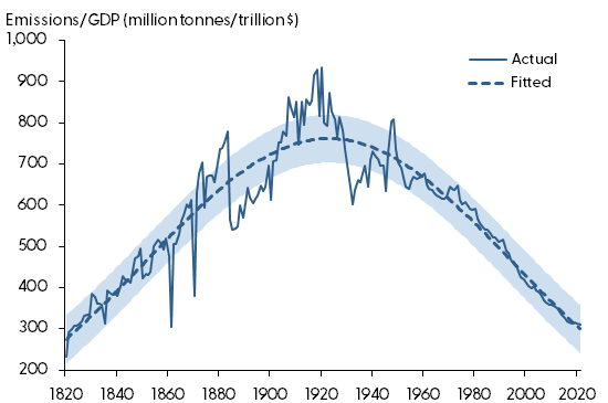
Sources: Emissions: Ritchie, Roser, and Rosado (2020), based on Global Carbon Budget data. GDP levels: Maddison Project Database, accessed through Our World in Data. GDP growth rates and 2019–2021 levels: Organisation for Economic Co-operation and Development (OECD).
Building emission projections using country data
To gain a better understanding of this pattern over time, we turn to more granular data on individual countries. We focus on the world’s six highest-emitting countries, which collectively account for about 75% of global emissions as of 2021: China with 37.88% of global emissions, the United States with 16.53%, India with 8.95%, Russia with 5.80%, Japan with 3.52%, and Germany with 2.23%.
We classify these countries into two groups. The first group, including the United States, Japan, and Germany, represents large advanced economies, while the second group, China, India, and Russia, represents large emerging economies. This classification helps us broadly characterize the paths and challenges ahead for these two types of economies, rather than relying on aggregate numbers.
Figure 2 shows emission intensity—defined earlier as the ratio of total emissions to total economic output—averaged for the advanced economies group (solid blue line) and the emerging economies group (solid red line). Data for Russia is only available since 1960. To avoid a large jump in the series at that date, we approximate Russian data before then using the average of data for China and India because all three countries follow similar historical paths.
Figure 2
CO2 emission intensity by country group
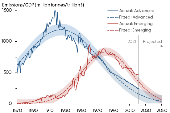
Sources: Emissions: Ritchie, Roser, and Rosado (2020), based on Global Carbon Budget data. GDP levels: Maddison Project Database, accessed through Our World in Data, and authors’ calculations. GDP growth rates and 2019–2021 levels: Organisation for Economic Co-operation and Development (OECD).
For both groups, we find that emission intensity is currently declining, implying that all countries are emitting less carbon per dollar of output produced relative to their respective peak emission intensity. In the case of the group of advanced economies, the decline of emission intensity began in the 1920s. For the group of emerging economies, the decline started from a lower peak level and took place much later, in the 1980s, which aligned with their economic development.
To model these trends of emission intensity, we find that fitting the data to bell-shaped curves again works surprisingly well for the two groups, as shown by the dashed lines in Figure 2, as well as at the individual country level (not shown). Focusing on the sample up to 2021, the dashed lines show that the bell-shaped curves nicely describe the magnitude of the emission intensity’s peak, the timing of when the peak occurs, and how quickly emission intensity declines from the peak.
The fitted curves also allow us to extrapolate the emission intensity for each group into the future. These projections are reported in Figure 2 to the right of the vertical line marking 2021. One major assumption underlying our extrapolation is that emission intensity will continue to decline at the rate dictated by the shape of the bell curve; despite the inherent uncertainty in projecting such trends, we believe that using history as a guide is a reasonable assumption.
Emission intensity is only one part of the equation. The other part is determined by the rate at which countries continue to grow in the future. Therefore, in Figure 3, we present three different scenarios of output growth for our two groups.
Figure 3
Projected real GDP by country group
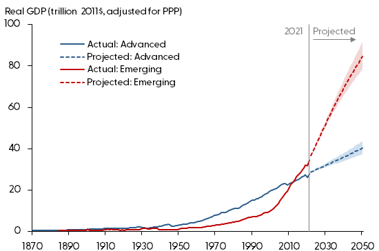
Source: Organisation for Economic Co-operation and Development (OECD).
The first scenario relies on OECD long-term baseline projections for GDP growth for each country in the two groups through the year 2050. For the advanced economies group, shown in blue, the OECD’s average annual growth rate is 1.5%. For the emerging economies group, in red, the OECD’s average annual growth is 6.2%. The second and third scenarios assume a quarter percentage point higher and lower annual rates of growth per year, respectively. Over 27 years, these scenarios cumulate to 7% higher and lower growth for each group, shown by the upper and lower bounds of the shaded blue and red ranges.
Estimating future emissions
We now have the two pieces needed to extrapolate emissions to 2050–emission intensity and output growth. Taking these pieces together, Figure 4 reports projected emissions by country group from 2021 to 2050. The solid lines report actual emissions for advanced (blue) and emerging (red) economies. The dashed lines show emissions predicted by our bell-shaped curve of emission intensity in combination with GDP projections. The figure also includes shaded regions that reflect both the uncertainty from the projections of our estimated bell curve, using plus and minus one standard deviation around the projections, and the range of assumptions for GDP growth based on OECD projections. Finally, we include horizontal lines corresponding to the 2030 emission reduction targets set by the countries of each group in accordance with Glasgow COP26. The targets were submitted as each country’s nationally determined contribution to the goal of limiting global temperature rise to 1.5°C (United Nations 2023). We calculated the target levels for the advanced and emerging economy groups by aggregating individual country-level commitments to the group level, shown by the two horizontal lines.
Figure 4
Projected emissions by country group
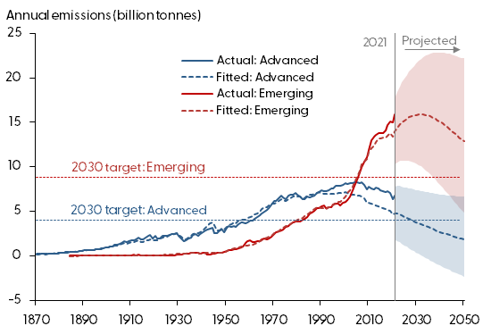
Sources: Emissions: Ritchie, Roser, and Rosado (2020), based on Global Carbon Budget data. GDP levels: Maddison Project Database, accessed through Our World in Data. GDP growth rates and 2019–2021 levels: Organisation for Economic Co-operation and Development (OECD). Country targets: United Nations (2023).
What are the takeaways from Figure 4? The distance between the data and the model predictions (solid and dashed lines, respectively) since the 1990s shows that emissions have been running higher than our modeling framework would have predicted. In essence, the two groups are falling behind the curve. How quickly future emissions will decline is uncertain, as the wide ranges of our predictions suggest. Our exercise cannot project the potential effects of technological changes, economic shocks, and other sources of output and emissions variation. This means that the range of possible values shown in Figure 4 is likely to be even wider. Regardless of these sources of uncertainty, a comparison between the predictions and the 2030 commitments suggests that reaching these targets may require more extensive efforts from the countries in our sample.
Conclusion
Countries worldwide have stated their commitments to reduce CO2 emissions over the next few decades. The lessons that we draw from our exercise in this Letter serve to sketch a more general view of the challenges to advanced and emerging economies when it comes to reducing fossil fuel emissions. Reaching 2030 targets may involve significant efforts to reduce emissions and have the potential to involve substantial economic changes to production, technology, use of resources, and saving and investment decisions (Fried, Novan, and Peterman 2021). Focusing on the top six emitting countries, we find that their emission intensity has considerably improved in the past few decades, though total emissions have been higher than expected over the past 40 years. Considering a relatively wide range of economic growth prospects, we find that—even with improvements in cleaner production technologies—countries are likely to fall well short of their intended emission reduction by 2030 and beyond.
Zoë Arnaut
Research Associate, Economic Research Department, Federal Reserve Bank of San Francisco
Òscar Jordà
Senior Policy Advisor, Economic Research Department, Federal Reserve Bank of San Francisco
Fernanda Nechio
Vice President, Economic Research Department, Federal Reserve Bank of San Francisco
References
Fried Stephie, Kevin Novan, and William B. Peterman. 2021. “The Economy’s Response to Potential Climate Policy.” FRBSF Economic Letter 2021-16 (June 21).
Gillingham, Kenneth, and James H. Stock. 2018. “The Cost of Reducing Greenhouse Gas Emissions.” Journal of Economic Perspectives 32(4), pp. 53–72.
Kaya, Yoichi, and Keiichi Yokobori. 1997. Environment, Energy, and Economy: Strategies for Sustainability. New York: United Nations University Press.
United Nations. 2021. “COP26: Together for Our Planet.” United Nations Climate Action website. Accessed August 25, 2023.
United Nations. 2023. “Nationally Determined Contributions Registry.” United Nations Climate Change website. Accessed October 3, 2023.
Ritchie, Hannah, Max Roser, and Pablo Rosado. 2020. “CO2 and Greenhouse Gas Emissions.” Our World in Data website. Accessed August 25, 2023.
Opinions expressed in FRBSF Economic Letter do not necessarily reflect the views of the management of the Federal Reserve Bank of San Francisco or of the Board of Governors of the Federal Reserve System. This publication is edited by Anita Todd and Karen Barnes. Permission to reprint portions of articles or whole articles must be obtained in writing. Please send editorial comments and requests for reprint permission to research.library@sf.frb.org