
During the 1970s and early 1980s, rises in inflation tended to coincide with weaker economic activity and lower stock prices. But in more recent decades, rises in inflation have tended to coincide with stronger economic activity and higher stock prices. The emergence of a pattern where inflation, economic activity, and stock prices all move together over the business cycle can be traced to the beneficial effects of well-anchored inflation expectations.
One way to think about factors that affect inflation is a mathematical relationship called the Phillips curve; it states that inflation is influenced by the level of economic activity and the inflation rate people expect for the future. When a central bank is credible, people’s inflation expectations are relatively insensitive to fluctuations in the observed inflation rate. This environment is described as one in which expectations are “well anchored.” Achieving well-anchored inflation expectations is typically viewed as the result of monetary policy keeping inflation close to the central bank’s target rate for an extended period.
In this Economic Letter, we construct a quantitative measure of anchoring for expected inflation. Specifically, we measure how much professional economists adjust their inflation forecasts in response to recent movements in actual inflation. The anchoring measure is higher when the amount of forecast adjustment is lower. This anchoring measure has trended up over the past two decades. Over the same period, movements in inflation have become positively correlated with movements in both economic activity and stock prices. When inflation expectations were poorly anchored in the 1970s and early 1980s, rises in inflation tended to coincide with weaker economic activity and lower stock prices. But in more recent decades, when inflation expectations have been well anchored, rises in inflation have tended to coincide with stronger economic activity and higher stock prices.
According to the Phillips curve, improved anchoring of expected inflation means that inflation will be driven less by expectations and more by the level of economic activity. Because stock prices also respond to economic activity, the emergence of a pattern where inflation, economic activity, and stock prices all move together over the business cycle can be traced to the beneficial effects of well-anchored inflation expectations.
Constructing an anchoring measure for expected inflation
Bernanke (2007) defines the term “anchored” to mean that expected inflation is “relatively insensitive to incoming data.” Consistent with this idea, Figure 1 shows that the median forecast of professional economists for one-year-ahead consumer price index (CPI) inflation has become less sensitive to actual CPI inflation. The figure shows the results of regressions measuring the strength of the relationship between one-year-ahead expected CPI inflation (vertical axis) and the contemporaneous four-quarter CPI inflation rate (horizontal axis). For the period from 1949 through the end of 1998, the blue line indicates a strong relationship with a slope of 0.71, implying that the median inflation forecast adjusts nearly one-for-one with actual inflation. The regression yields a much smaller slope of 0.18 for the period from 1999 through the second quarter of 2023 (red line), implying very little forecast adjustment in response to actual inflation.
Figure 1
Sensitivity of expected inflation to current inflation
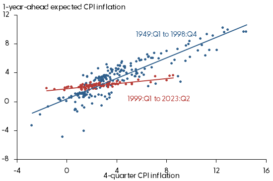
Source: Bureau of Labor Statistics, FRB Philadelphia, and authors’ calculations.
To construct our quarterly anchoring measure for expected inflation, we perform a series of similar regressions, each covering a rolling 20-year window of data. The initial window covers the first quarter of 1949 through the fourth quarter of 1968, recording the result on the end date. As the window shifts forward, we drop the oldest quarter and add one more-recent quarter. We construct the anchoring measure by subtracting the slope value of the regression from 1; in this way, a lower slope value—which implies less adjustment of the median inflation forecast—yields a higher anchoring score.
Figure 2 shows that the anchoring measure (red line) declines during the “Great Inflation” of the 1970s and early 1980s, when inflation rose and became highly volatile. Anchoring then improves gradually into the 1990s, when the level and volatility of inflation both declined. Starting in the early 2000s, the anchoring measure rises as the Great Inflation era drops out of the moving window and is replaced by an era of low and stable inflation. At the end of the sample in the second quarter of 2023, the anchoring measure remains close to its all-time high, despite elevated inflation levels over the past two years.
Figure 2
Anchoring measure and inflation-output gap correlation
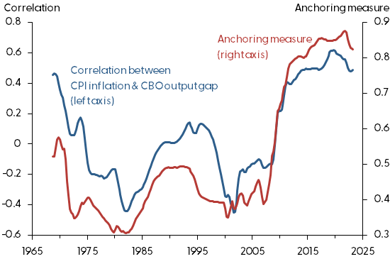
Source: Congressional Budget Office, Bureau of Labor Statistics, and authors’ calculations.
Inflation and economic activity
For comparison with the anchoring measure, Figure 2 also displays the 20-year rolling correlation between four-quarter CPI inflation and a gauge of economic activity known as the output gap. The output gap is the percent deviation of real GDP from potential GDP constructed by the Congressional Budget Office. The evolving correlation pattern between inflation and the output gap is strikingly similar to the path of the anchoring measure. The correlation is negative during the Great Inflation, when inflation expectations were poorly anchored. But in recent decades when inflation expectations have become well anchored, the correlation has turned positive.
Using an economic model that includes a Phillips curve, Jørgensen and Lansing (2023) provide an explanation for the shifting correlation pattern between inflation and economic activity. The model predicts the emergence of a positive correlation between the two variables when expected inflation shifts from an environment of weak anchoring to strong anchoring. If lax monetary policy allows inflation to drift away from target for extended periods, people will come to view inflation movements as persistent, resulting in weak anchoring. In this case, expected inflation, which appears on the right side of the Phillips curve equation, can be approximated by lagged inflation. As a result, the change in inflation—defined as inflation minus lagged inflation—is positively linked to economic activity on the right side of the equation (see also Jørgensen and Lansing 2021). But if vigilant monetary policy keeps inflation close to target, then people will come to view inflation movements as transitory, resulting in strong anchoring. In this case, expected inflation can be approximated by a constant value of, say, 2%. As a result, the level of inflation on the left side of the Phillips curve equation becomes positively linked to economic activity on the right side.
An alternative hypothesis for the shifting correlation pattern between inflation and economic activity is the idea that demand shocks, which push economic activity and inflation in the same direction, have become more important in recent decades than supply shocks, which push the two in opposite directions. For example, unexpected higher demand for consumer goods would push up prices and lead to higher inflation via the Phillips curve. In contrast, an unexpected drop in oil supply that raises oil prices and inflation would push down economic activity. To assess this hypothesis, we turn to Shapiro (2022), who separates movements in the one-month personal consumption expenditures (PCE) inflation rate into demand- and supply-driven components. From January 1998 through June 2023, supply-driven inflation exhibits both a higher average level and a higher standard deviation than demand-driven inflation. Over the same period, the correlation between inflation and economic activity shifted from negative to positive, which casts doubt on the alternative hypothesis.
Inflation and stock prices
The shifting correlation pattern between inflation and economic activity has implications for how stock prices move with inflation. In theory, stock prices are determined by the present value of expected future earnings distributions, or cash flows, that corporations pay out to shareholders. Stock prices are procyclical, increasing during economic booms or recoveries and decreasing during recessions. This is because economic activity is a key determinant of corporate earnings and the resulting distributions to shareholders.
If inflation tends to rise during economic booms or recoveries, then one would expect a positive correlation between inflation and stock prices. But if inflation tends to rise during recessions, then one would expect a negative correlation between inflation and stock prices. Cieslak and Pflueger (2023) label these two contrasting business cycle patterns as environments with “good” or “bad” inflation, respectively.
Figure 3 provides an initial look at the relationship between four-quarter CPI inflation and a measure of stock market valuation known as the cyclically adjusted price-earnings (CAPE) ratio. The CAPE ratio is computed as the real, or inflation-adjusted, value of the Standard and Poor’s 500 stock price index divided by the real earnings of companies in the index averaged over the most recent 10 years.
Figure 3
CPI inflation and the CAPE ratio
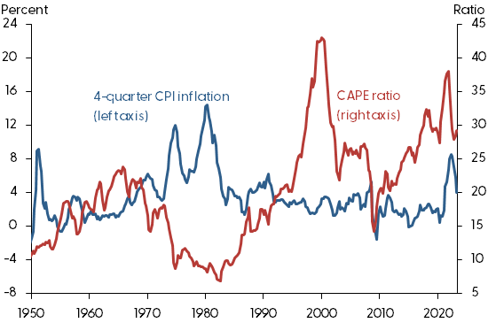
The CAPE ratio declines during the 1970s and early 1980s when inflation rose and became highly volatile. The CAPE ratio then recovers into the 1990s when the level and volatility of inflation both declined. The CAPE ratio declines after the technology stock bubble burst in the early 2000s and then declines further in response to the Global Financial Crisis in 2008 and 2009. After the crisis, the CAPE ratio increases over the next decade during a period of low and stable inflation.
One hypothesis to explain a negative correlation between inflation and stock prices is the idea that stock investors fail to properly account for inflation in their present value calculations (Lansing 2004). This could occur if investors increase the discount rate applied to future nominal cash flows in response to an inflation-induced rise in the nominal interest rate but, for some reason, fail to make a similar upward adjustment to the expected growth rate of those same nominal cash flows. While this hypothesis can explain the negative correlation between inflation and stock prices during the Great Inflation and the 1990s, it cannot account for the emergence of a positive correlation in recent decades. Improved anchoring of expected inflation is an alternative hypothesis that can account for the shifting correlation pattern between inflation and stock prices. This is because improved anchoring leads to a positive correlation between inflation and economic activity via the Phillips curve.
Figure 4 compares our anchoring measure for expected inflation with the 20-year rolling correlation between four-quarter CPI inflation and the CAPE ratio. As in Figure 2, the correlation pattern is strikingly similar to the path of the anchoring measure. The correlation is strongly negative during the Great Inflation era when inflation expectations were poorly anchored. But in recent decades when inflation expectations have become well anchored, the correlation turns positive. Taken together, the patterns in Figures 2 and 4 support the view that improved anchoring of expected inflation has influenced how inflation moves together with economic activity and stock prices over the business cycle.
Figure 4
Anchoring measure and inflation-CAPE ratio correlation
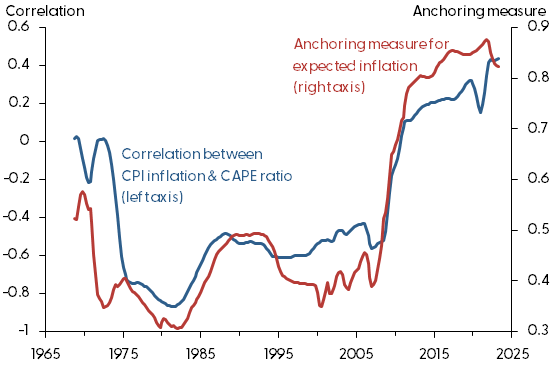
Note: Correlation measure ranges between -1 and 1. Anchoring measure computed as described in the text.
Conclusion
According to the Phillips curve, improved anchoring of expected inflation helps stabilize inflation in response to economic shocks. For this reason, central banks closely monitor data on expected inflation and pursue actions and communications designed to promote well-anchored inflation expectations. With improved anchoring, expected inflation in the Phillips curve becomes more stable so that inflation is driven less by expected inflation and more by the level of economic activity. Because stock prices also respond to economic activity, the emergence of a pattern where inflation, economic activity, and stock prices all move together over the business cycle can be traced to the effects of well-anchored inflation expectations.
The views expressed are those of the authors and do not necessarily reflect those of the Bank of Italy, the Federal Reserve Bank of San Francisco, or the Federal Reserve System.
References
Bernanke, Ben. 2007. “Inflation Expectations and Inflation Forecasting.” Speech at the Monetary Economics Workshop of the NBER Summer Institute, Cambridge, MA (July 10).
Cieslak, Anna, and Carolin Pflueger. 2023. “Inflation and Asset Returns.” NBER Working Paper 30982.
Jørgensen, Peter Lihn, and Kevin J. Lansing. 2021. “Return of the Original Phillips Curve.” FRBSF Economic Letter 2021-21 (August 9).
Jørgensen, Peter Lihn, and Kevin J. Lansing. 2023. “Anchored Inflation Expectations and the Slope of the Phillips Curve.” FRB San Francisco Working Paper 2019-27 (revised February 2023).
Lansing, Kevin J. 2004. “Inflation-Induced Valuation Errors in the Stock Market.” FRBSF Economic Letter 2004-30 (October 29).
Shapiro. Adam H. 2022 “How Much Do Supply and Demand Drive Inflation?” FRBSF Economic Letter 2022-15 (June 21). Monthly data updates available at Supply- and Demand-Driven PCE Inflation.
Opinions expressed in FRBSF Economic Letter do not necessarily reflect the views of the management of the Federal Reserve Bank of San Francisco or of the Board of Governors of the Federal Reserve System. This publication is edited by Anita Todd and Karen Barnes. Permission to reprint portions of articles or whole articles must be obtained in writing. Please send editorial comments and requests for reprint permission to research.library@sf.frb.org